
We cannot be happier to formally present our award recipients from our 2024 Design Awards, celebrating the most innovative and impactful architectural projects of the year. After reviewing a staggering number of submissions, our panel of judges selected a diverse group of visionary designs that push the boundaries of creativity, sustainability, and functionality. These projects represent the best of the best, showcasing exceptional talent, craftsmanship, and forward-thinking design.
Categories
Adaptive Reuse
Honor
Washington Street
By Alexander Jermyn Architecture
Photography by Douglas Sterling Photography
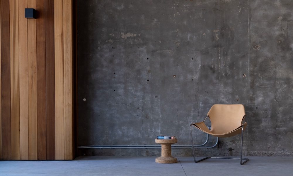
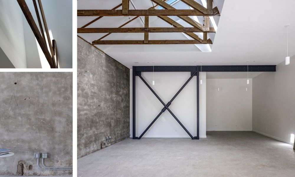
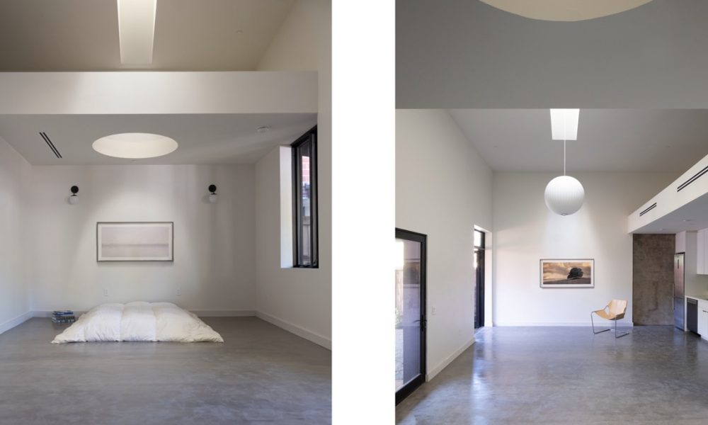
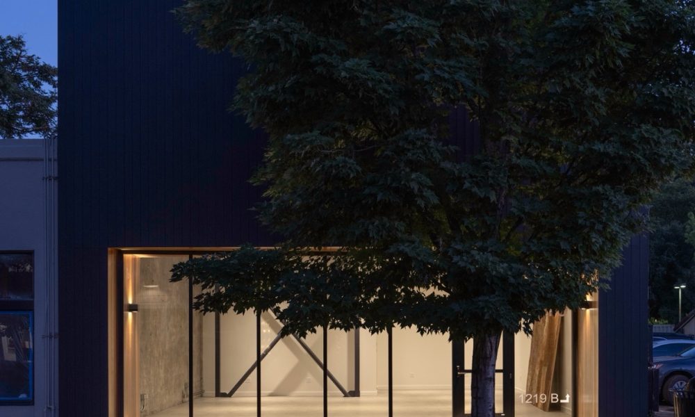
This project prioritizes sustainability and urban renewal at a small scale in downtown Calistoga. This 1,800 square foot reconstruction maintains the existing footprint of a former hair salon and transforms it into a leasable 1,300 square foot commercial space in the front, and a 500 square foot residential unit in the rear. The project significantly reduces its environmental footprint by preserving the century old existing concrete walls and redwood trusses, minimizing waste and resource consumption. Strategic installation of skylights introduce a layered approach to daylight. This fully electric building is designed with the goal of achieving net zero energy (NZE). This development supports small-scale urban density by reimagining existing spaces to enhance housing and appropriately sized commercial areas in the downtown region.
Interiors
Merit
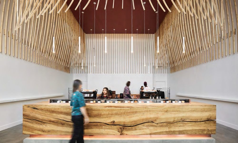
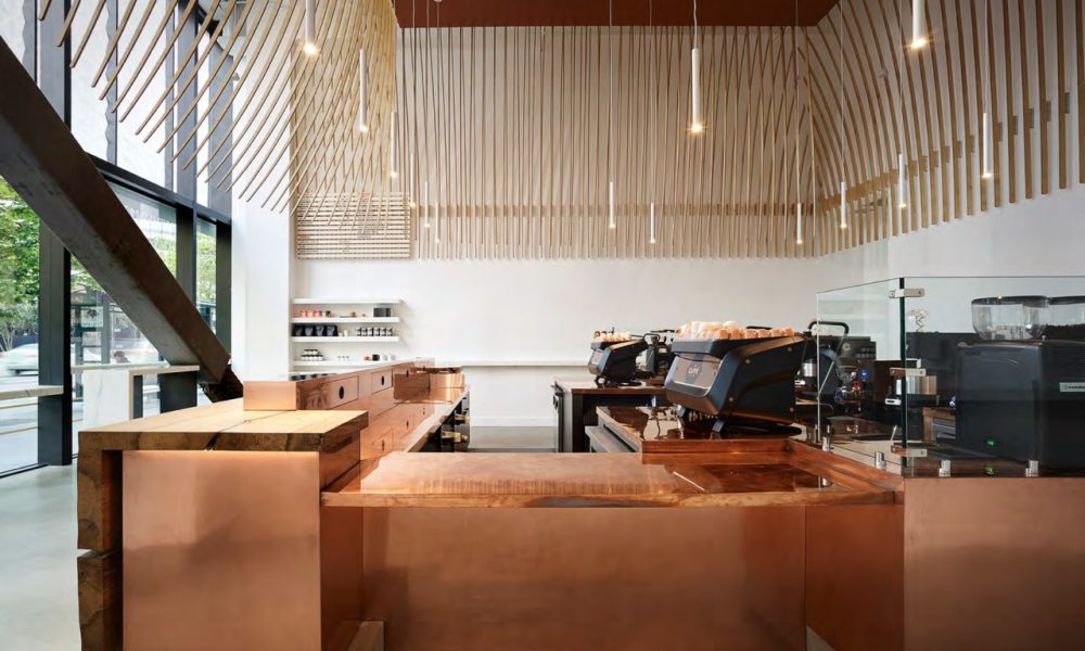
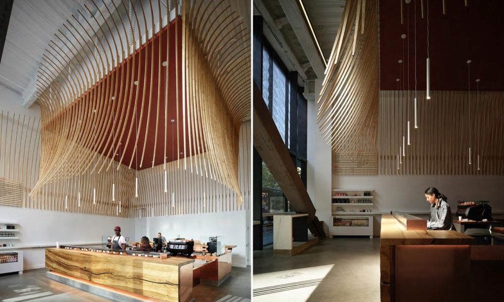
The Caffè by Mr. Espresso
By jones | haydu
Photography by Matthew Millman Photography
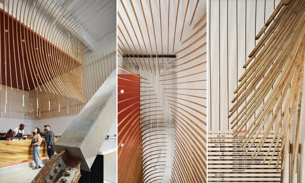
Informed heavily by Italian cuisine, which is masterful at creating great complexity with minimal ingredients, we chose to minimize the number of materials used, and to celebrate their innate richness. Crafted from slabs of a single white oak tree that fell in Sonoma in 2008, the primary bar frames nature as the focus. The perimeter of the caffe hosts a Calacatta marble ledge, a nod to Italy’s most ubiquitous, yet luscious, materials. Behind the bar, hand polished copper contrasts with the organic nature of wood and stone. The Italian notion of contrast, “chiaroscuro”, provides further inspiration. Overhead, wood is used in a diaphanous fragile manner in contrast to the heavy stable oak bar. Highlighting the verticality of the space, it is a gestural move to provide both monumentality and intimacy; to form both an object (from outside the bar) to a space (once underneath). From some angles it is airy (chiaro); from others it is quite solid (oscuro). Though the shapes and fabrication process are modern, it is a nod to the domes and arcades of the Renaissance and Baroque periods.
Single Family
Distinction
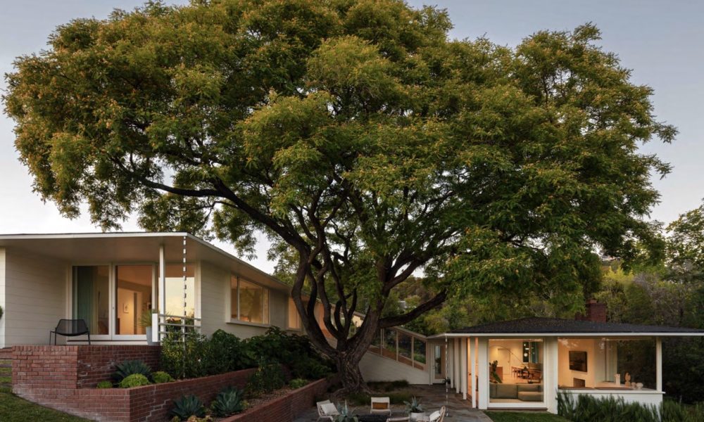
Piedmont Mid Century
By Turnbull Griffin Haesloop Architects
Photography by Jennifer Hughes, Photographers LLC
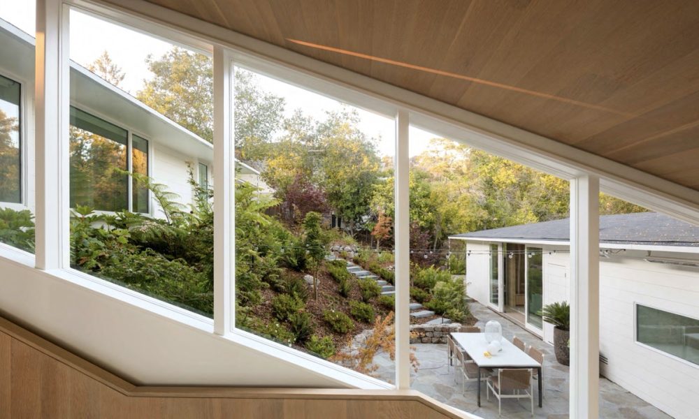
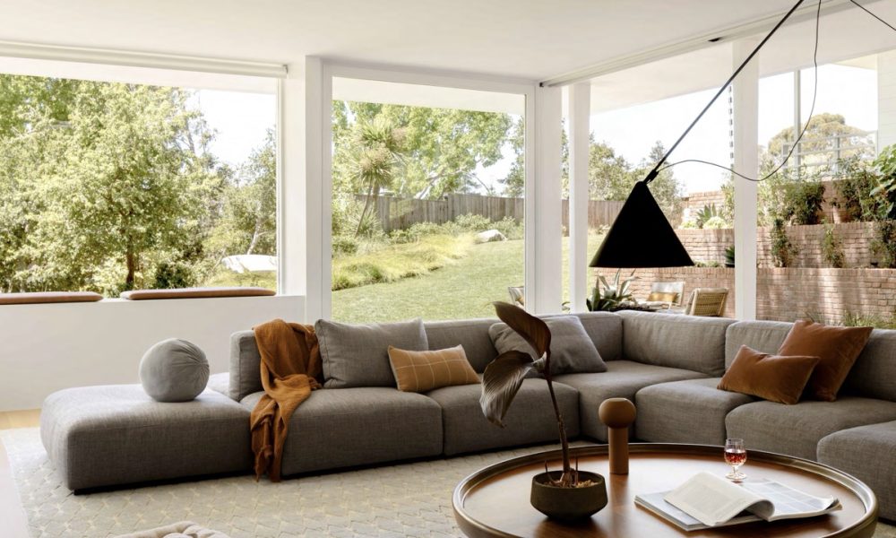
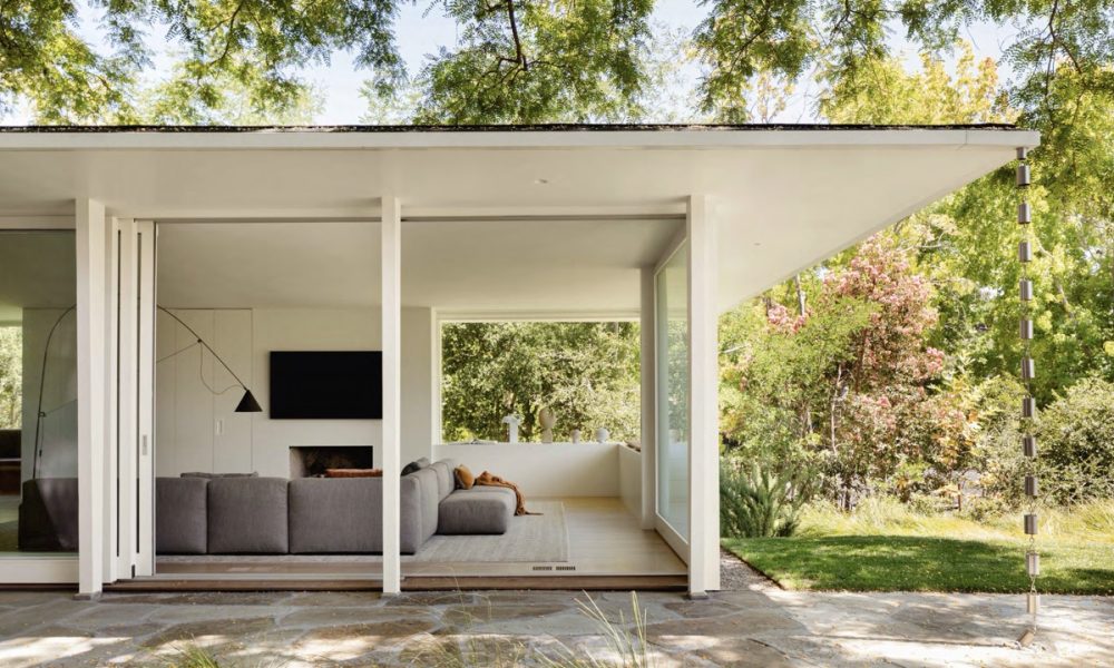
The existing house is one of the few mid-century modern houses in Piedmont, California. Designed by Clarence Mayhew in 1947. Through careful design insertions and structural stabilization, we were able to save the structure and give this 1940’s building a new lease on life. Programmatically we opened the many small rooms up to create a more informal living, dining, and kitchen area. We added an accessory dwelling unit where the old laundry yard had been. Our architectural response was to adjust the plan only as needed for the new more open layout with oak paneled insertions at the stairs and ceilings signifying where we adjusted the flow of space. The wooden stair ceiling follows the roof line and slopes up over the kitchen to reveal the framing and to balance the daylight in the center of the space.
Small Project
Merit
Cuvaison Boathouses
By Goring & Straja Architects
Photography by Bruce Damonte Photography
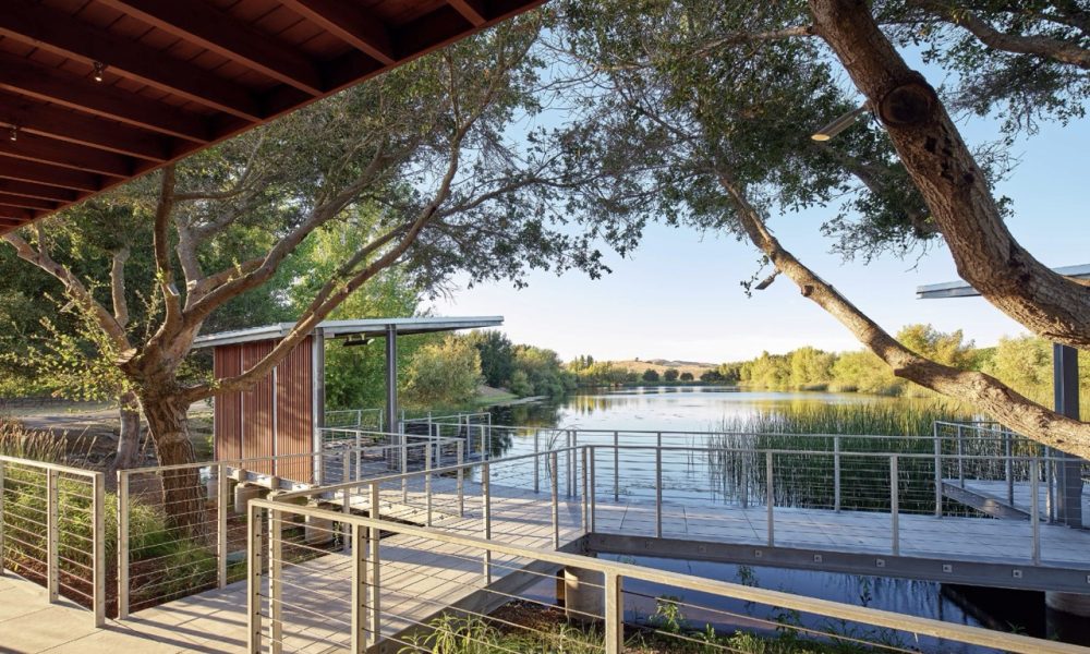
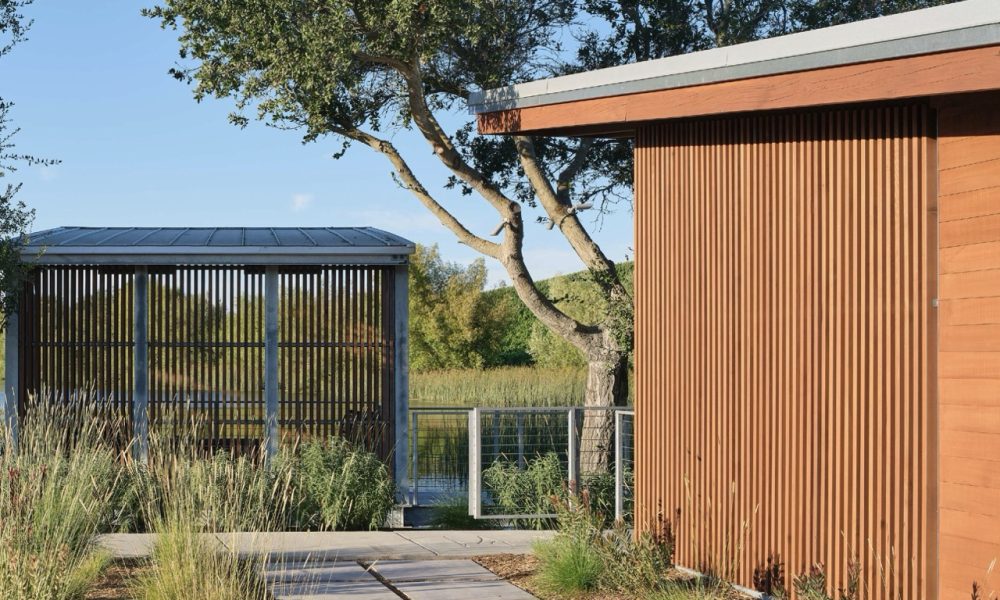
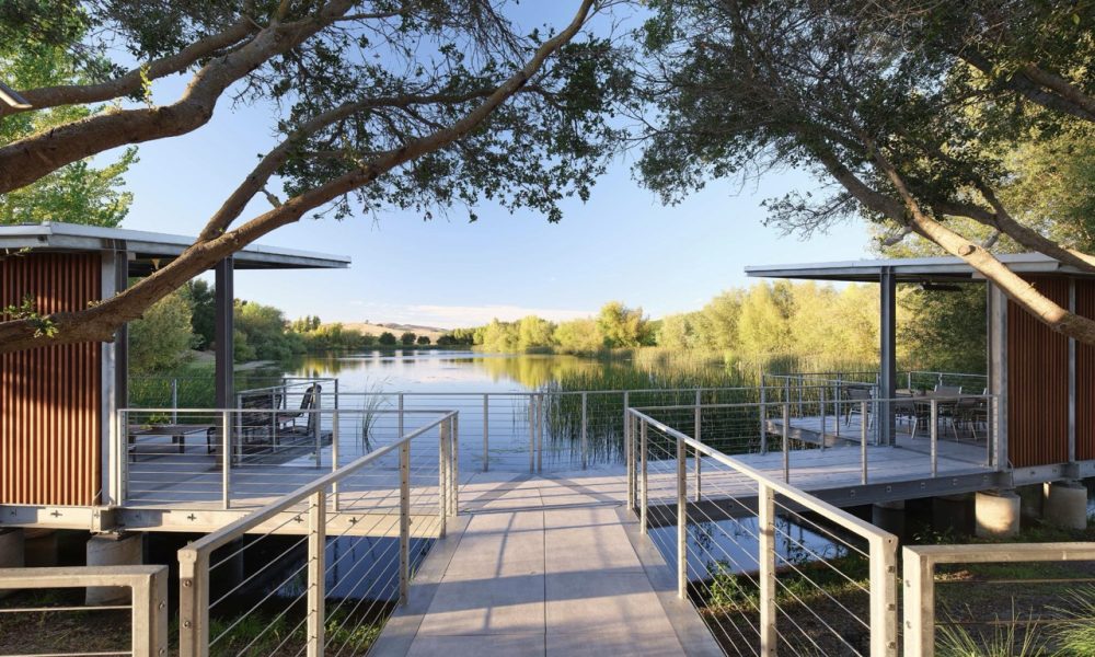
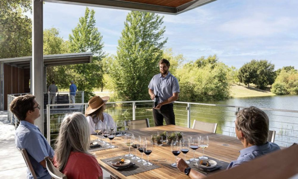
The leadership at Cuvaison Winery approached us to create an intimate wine tasting experience that would showcase the natural beauty of the property near their man-made irrigation pond. Unlike typical winery reservoirs, this pond is surrounded by native plants, creating a waterside environment that attracts several species of waterfowl and migratory birds. Early on, it was decided that placing a tasting pavilion near this unique, natural setting would offer guests a deeper appreciation for the winery’s stewardship of the land, beyond just its vineyards. The goal is to design a space where guests can enjoy their wine while fully immersing themselves in the serene surroundings.
Merit
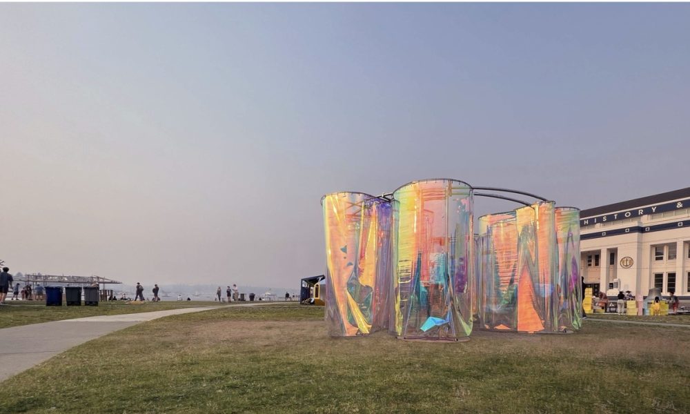
"Inside-O-Scope" Seattle Design Festival
“Inside-O-Scope” is an immersive art installation that sparks social curiosity through joyful exploration. Within this mesmerizing experience, viewers embark on a captivating journey where mirrored surfaces alter their perception of the environment, unveiling new dimensions of wonder. The interplay of light, reflection, and interactive elements creates an atmosphere that nurtures joy and fosters connections. “Inside-O-Scope” invites viewers to embrace the thrill of exploration, igniting social curiosity and a collective sense of wonder.
Unbuilt
Honor
Eastshore Infill
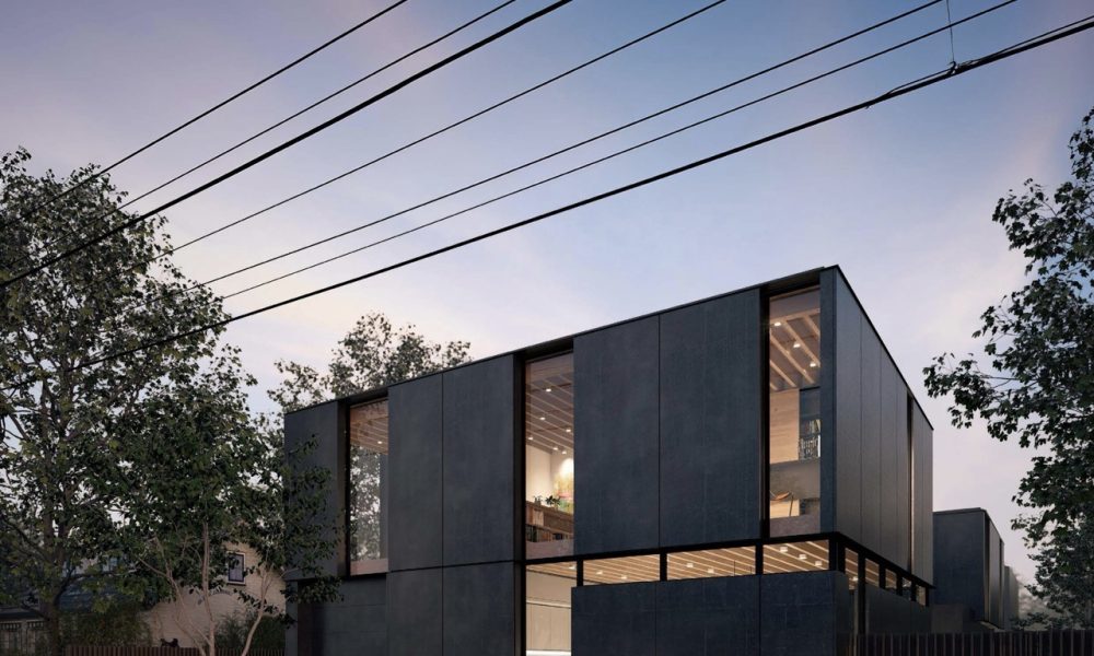
This project focuses on addressing the “missing middle”—housing types that fall between single-family homes and multi-family apartments. These middle-ground options fill a crucial gap needed to meet the diverse needs and income levels in Oakland. The Eastshore Infill project shows how a single-family lot can be transformed by adding a cluster of smaller, well-designed homes centered around courtyards. This approach increases residential density to improve housing availability while maintaining a high quality of life.
Student
Honor
Seasonal Institute of Fire
By Minghao Xu & Yining Ma
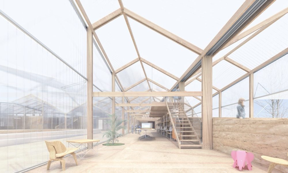
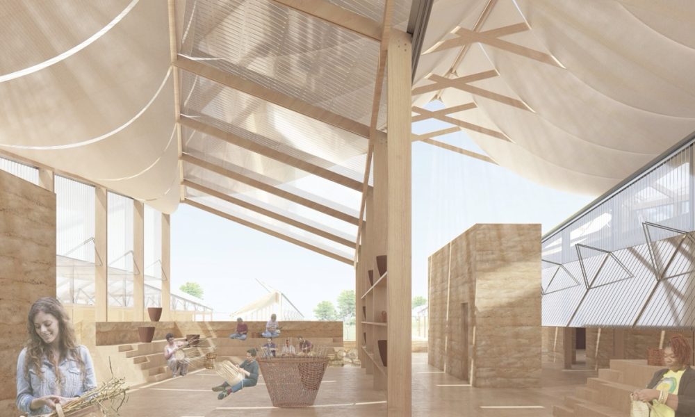
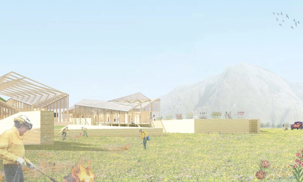
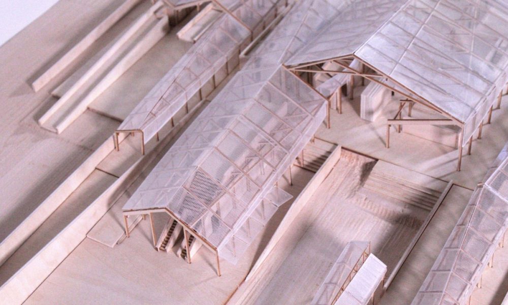
The Seasonal Institute of Fire is an adaptive architectural project designed to integrate human activities with the natural rhythms of California’s wildfire-prone landscape. Inspired by the wisdom of Charles and Ray Eames, the project explores flexibility in architecture, responding to both the environment and the needs of the community.
Located in the fire-affected regions of California, the institute promotes a sustainable relationship between human intervention and natural processes. The concept is anchored in seasonal activities—particularly the Native American practice of controlled burns, which both sustains biodiversity and reduces the risk of wildfire.
Distinction
Lignin and Lining
By Alexander Arebalo, Maggie Bao, Dimitra Chantzakou, Shenzhou Dai, Yiyao Guo, Zixion Lin, Sihang Liu, Andres Morelli, Clifford Vickrey, Rayna Zhang & Zizhao Zhou
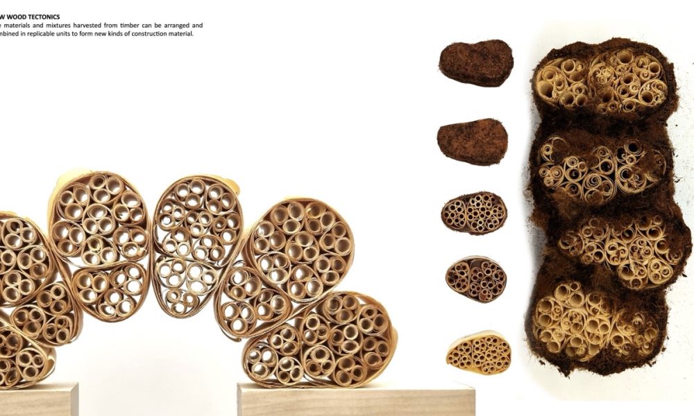
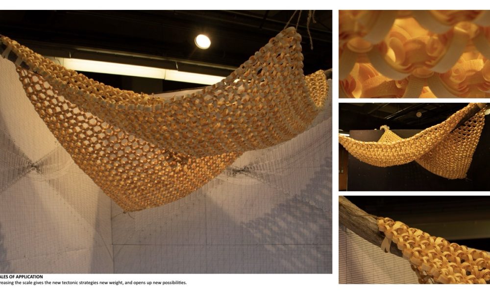
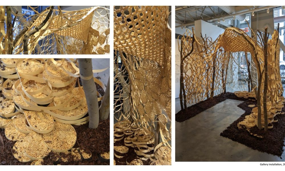
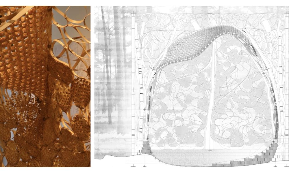
Wood processing and construction has much more waste than we might realize. A tree is so much more than the milled wood products that we typically use, but these other parts are regarded as waste. Bark, with it’s unique fire-resisting capabilities; resin, with it’s water-proofing properties; curved and forked timber, with their organically adaptive load-bearing capacity. By combining these materials with a high-yield processing method of planing to produce wood coils, “Lignin and Lining” investigates the untapped possibilities of wood in construction. While acknowledging human dependence on wood as a building material, it recognizes the far reaching effects of our harvesting and processing methods on the ecologies of which we are a part. It seeks not only to maximize the use of that which we harvest, but also to contribute to the healing and replacement of that which human activity removes and disrupts, through habitat renewal, building resilience against natural disasters, and efficient methods of sustainable forestry. Lignin and Lining proposes an approach to wood processing and manufacturing in the forests near Oroville, CA. It takes advantage of the economic value of material that up to now has been thrown away, while also taking a stance of habitat restoration and more responsible forestry.
Beyond
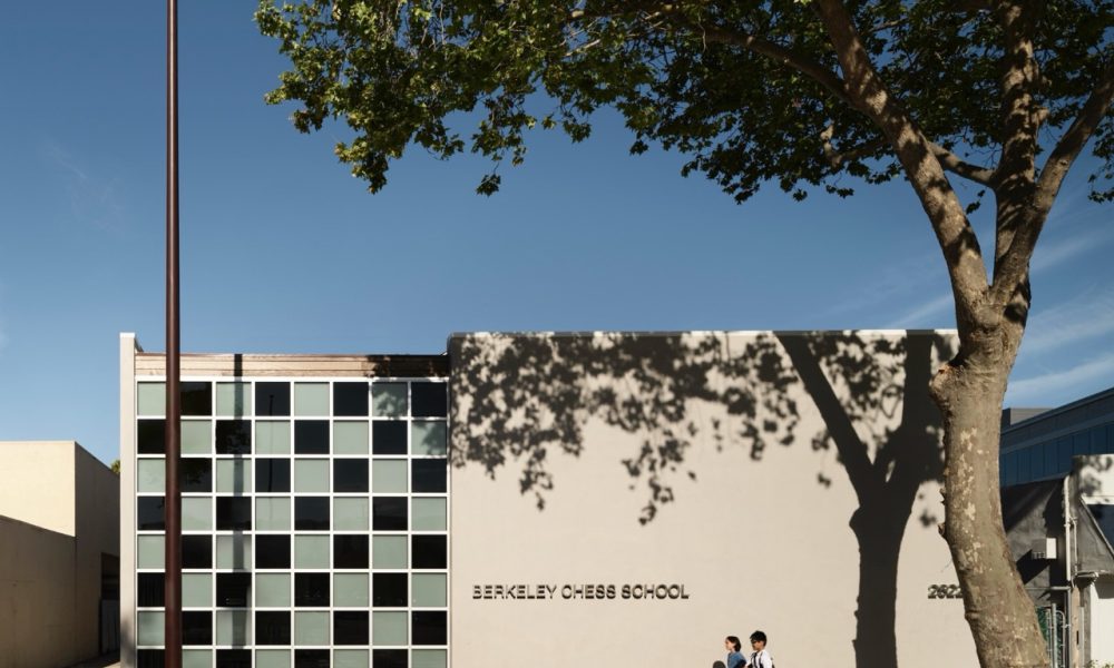
Berkeley Chess School
By Rangr Studio Architecture
Photography by Matthew Millman Photography
Berkeley Chess School was founded in 1981 as an after school program by Elizabeth Shaughnessy, the 1970 Irish Women’s Chess Champion. It has grown today to teach 7,000 children a year in the Bay Area, and has produced an unmatched three grandmasters. The founder’s primary goal, however, has always been to empower children by teaching them chess, a predictor of future success in STEM subjects. The school teaches for free where students would not otherwise have access to after-school programs, holds low-cost summer camps, and Friday night classes for kids throughout the year. BCS has been using teaching chess as a tool toward greater social equity for 40 years.
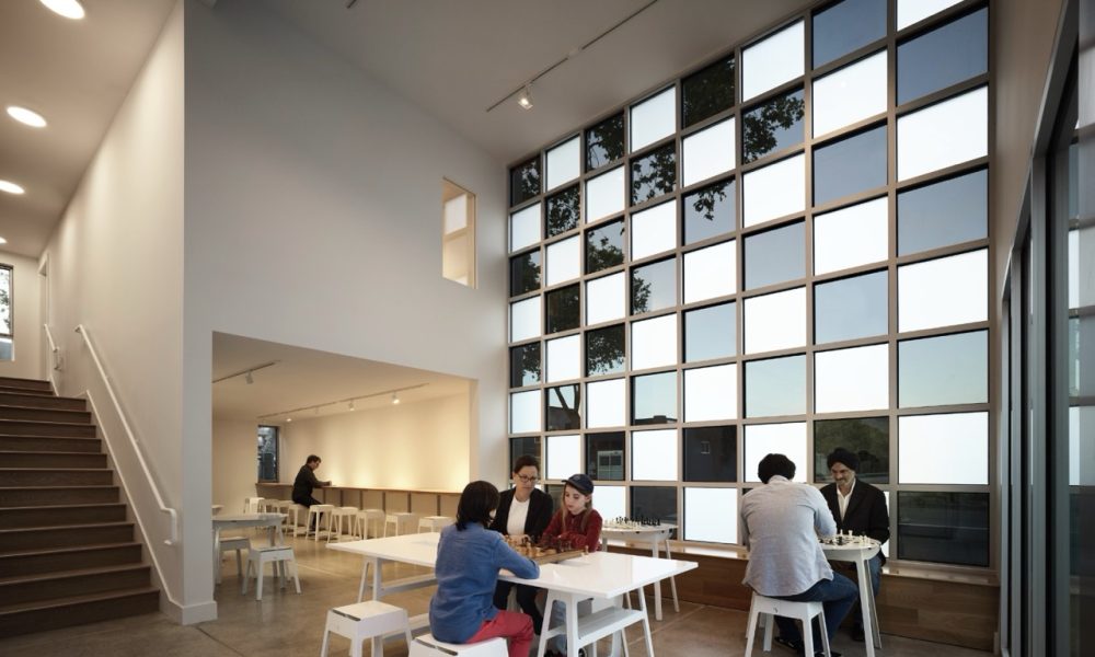
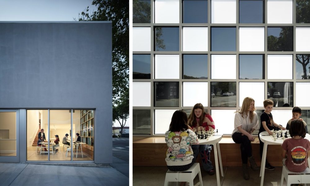
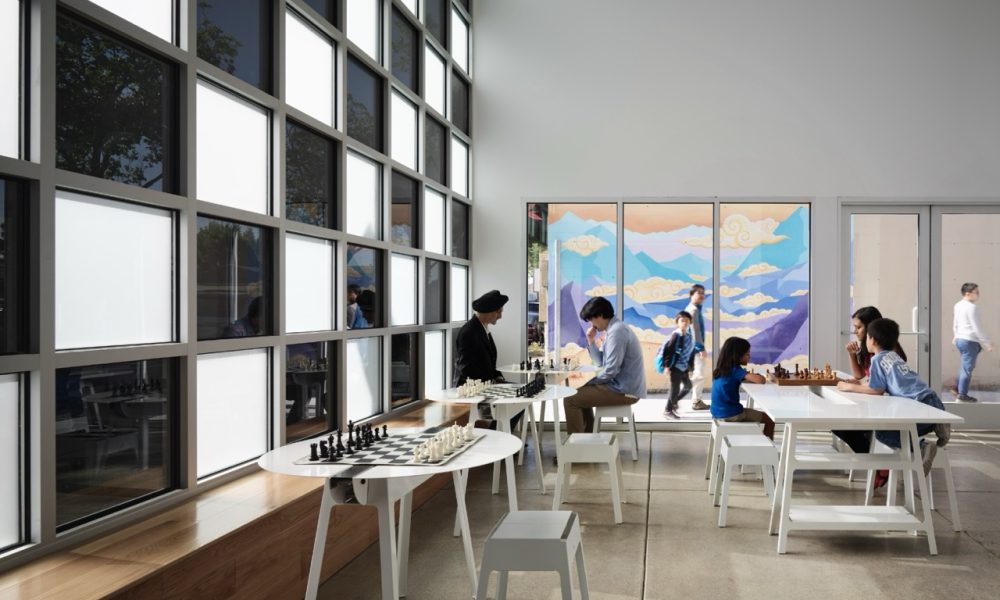
We were asked to provide a space to their existing building that would fit in their 800sf front yard, to give the school an ADA compliant lift to their existing tournament room, a lobby, a waiting area of parents, and an additional classroom, all within the non-profit’s shoestring budget. The common solution of a large glazed entry would eat up too much of the budget and space, so we got to thinking “what can we do with small (inexpensive) glass?” The idea of a chessboard facade came almost immediately to mind. Designed to be inexpensive to build, a storefront wall uses ordinary tinted and etched panes of glass to create the image of a chessboard. Visitors, students and teachers enter the building behind the chessboard window, metaphorically and literally entering the world of chess.
People's Choice
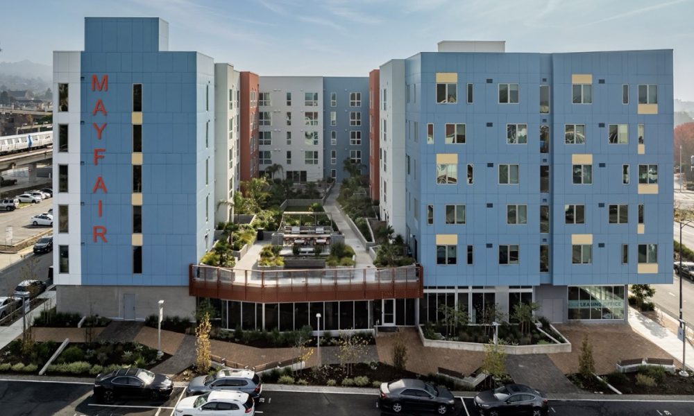
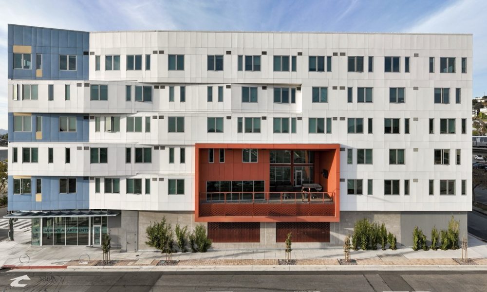
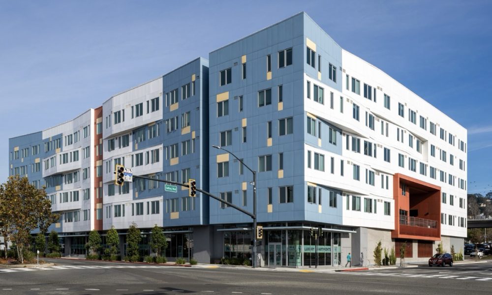
Mayfair Station
By Lowney Architecture
Photography by Hunter Kerhart Architectural Photography
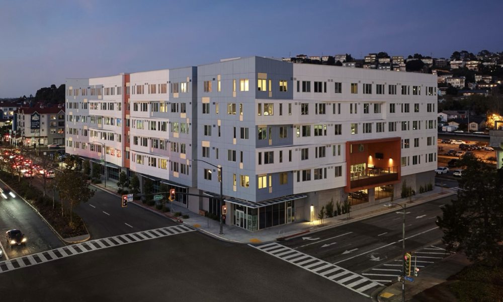
Mayfair Station in El Cerrito, CA, was designed to transform a neglected stretch of San Pablo Avenue into a vibrant community hub. The building’s proximity to BART, bus hubs, and the Ohlone Greenway offers convenient and healthy transportation options. It promotes a walkable lifestyle with ground-floor community spaces, street-facing retail, and a public mews that encourages social interaction. Universal design principles ensure accessibility for all ages and abilities, while shared spaces like the courtyard, fitness center, and lounges foster a sense of communit



Pingback: Piedmont Project Receives AIA East Bay Distinction Award - Kasten Builders