We are thrilled to announce the shortlisted projects for our 2024 Design Awards, celebrating the most innovative and impactful architectural projects of the year. After reviewing a staggering number of submissions, our panel of judges has selected a diverse group of visionary designs that push the boundaries of creativity, sustainability, and functionality. These finalists represent the best of the best, showcasing exceptional talent, craftsmanship, and forward-thinking design.
Take a look through the list of projects below, and be sure to secure your tickets to our 2024 Design Awards Gala on November 14th, where we will be announcing our award winners as well as voting for the coveted People’s Choice Award!
Categories
Adaptive Reuse
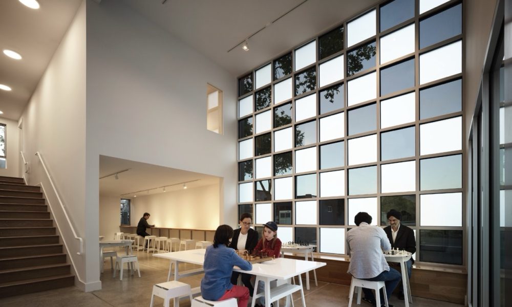
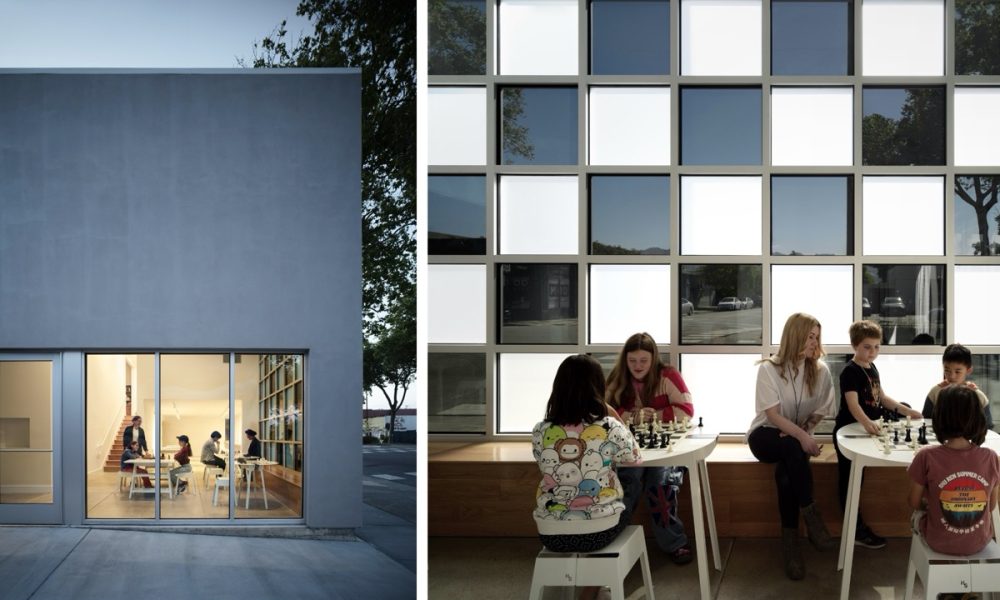
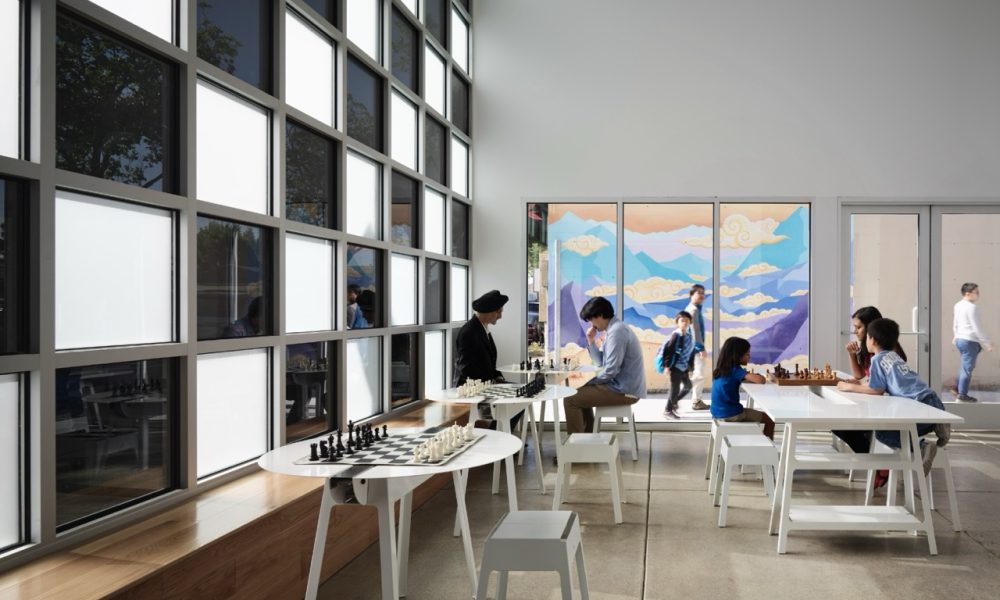
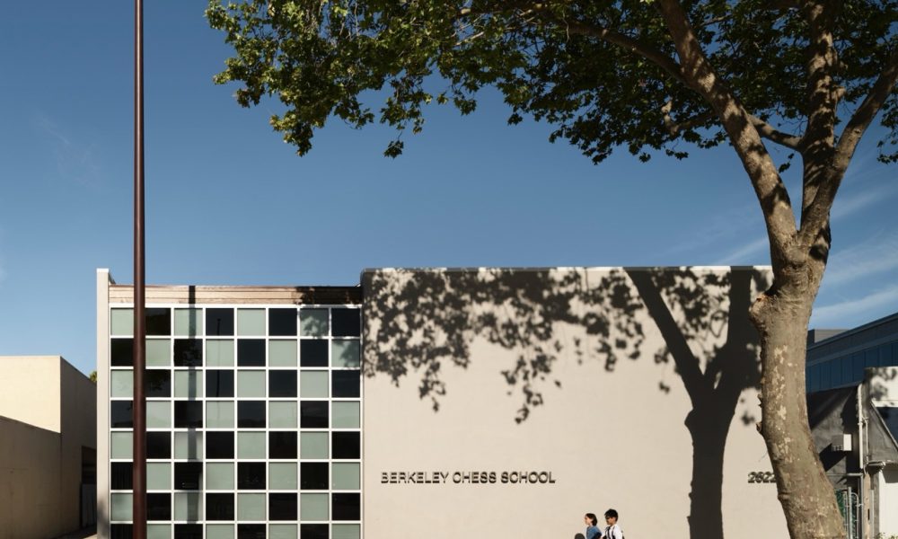
Berkeley Chess School
By Rangr Studio Architecture
Photography by Matthew Millman Photography
Berkeley Chess School was founded in 1981 as an after school program by Elizabeth Shaughnessy, the 1970 Irish Women’s Chess Champion. It has grown today to teach 7,000 children a year in the Bay Area, and has produced an unmatched three grandmasters. The founder’s primary goal, however, has always been to empower children by teaching them chess, a predictor of future success in STEM subjects. The school teaches for free where students would not otherwise have access to after-school programs, holds low-cost summer camps, and Friday night classes for kids throughout the year. BCS has been using teaching chess as a tool toward greater social equity for 40 years.
We were asked to provide a space to their existing building that would fit in their 800sf front yard, to give the school an ADA compliant lift to their existing tournament room, a lobby, a waiting area of parents, and an additional classroom, all within the non-profit’s shoestring budget. The common solution of a large glazed entry would eat up too much of the budget and space, so we got to thinking “what can we do with small (inexpensive) glass?” The idea of a chessboard facade came almost immediately to mind. Designed to be inexpensive to build, a storefront wall uses ordinary tinted and etched panes of glass to create the image of a chessboard. Visitors, students and teachers enter the building behind the chessboard window, metaphorically and literally entering the world of chess.
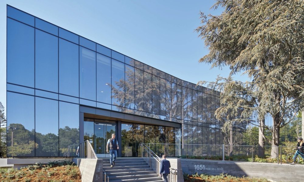
Stanford University School of Medicine 1651 Page Mill Road Renewal
By HOK
Photography by Bruce Damonte Photography
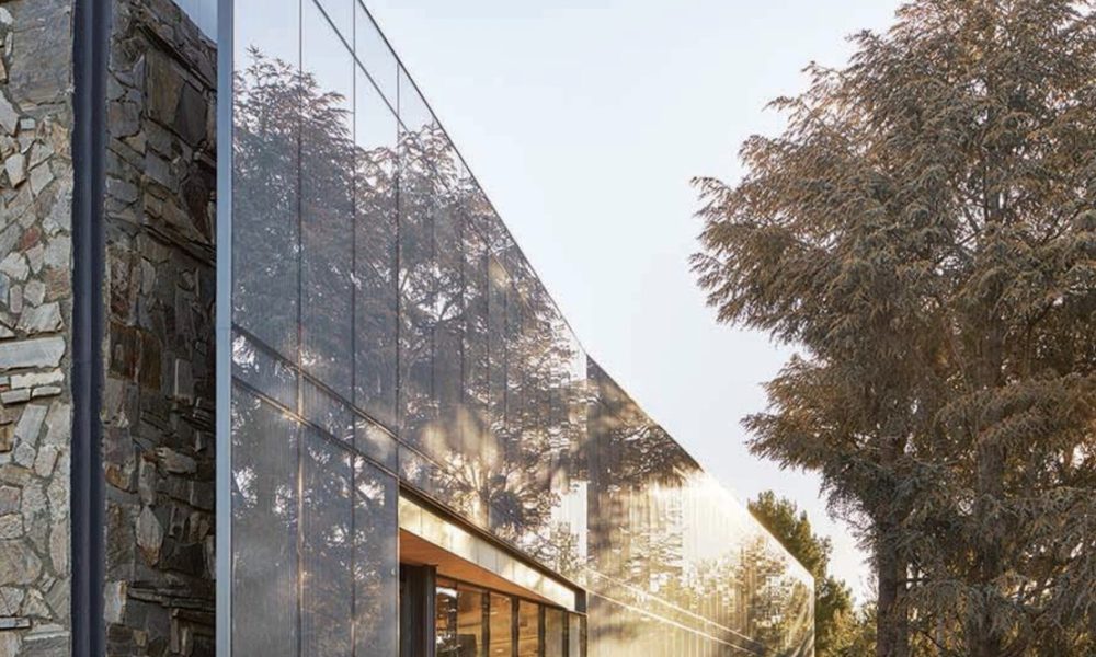
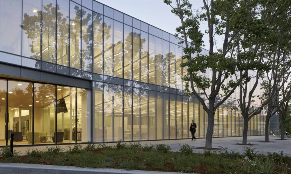
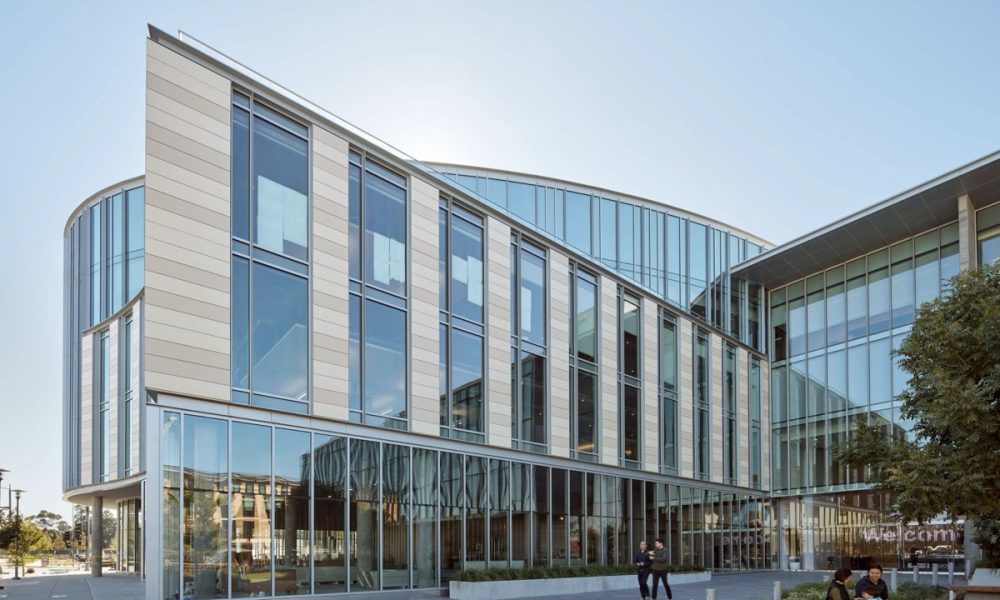
Beginning with the exterior, the design removes 12-foot-deep overhangs on the north and south façade, replacing the outdated storefront windows with a high-performance curtain wall. The floorto-ceiling glass of simple, origami-like folds floats above a wide-planked boardwalk that extends from inside the workplace to the edge of the outdoor gardens, blurring the lines between interior and external environments.
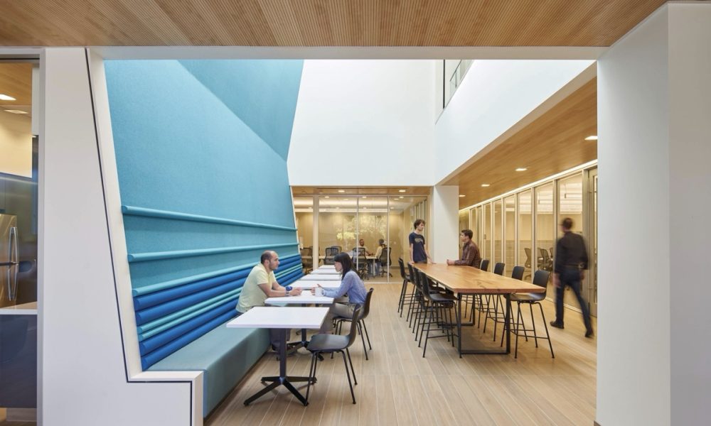
Reconfiguring the interior into a three-tiered, horizontal layer of program spaces, each successive spatial layer to opens into the next, borrowing daylight and outdoor views from the previous space. Similarly, skylights bring daylight deep into the open, two-story gathering and circulation spaces.
Washington Street
By Alexander Jermyn Architecture
Photography by Douglas Sterling Photography
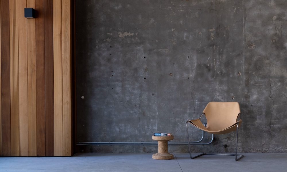
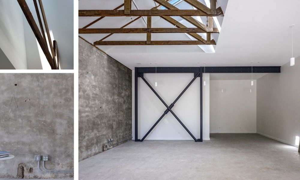
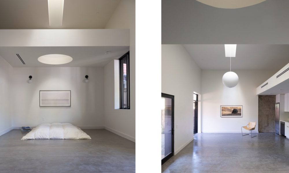
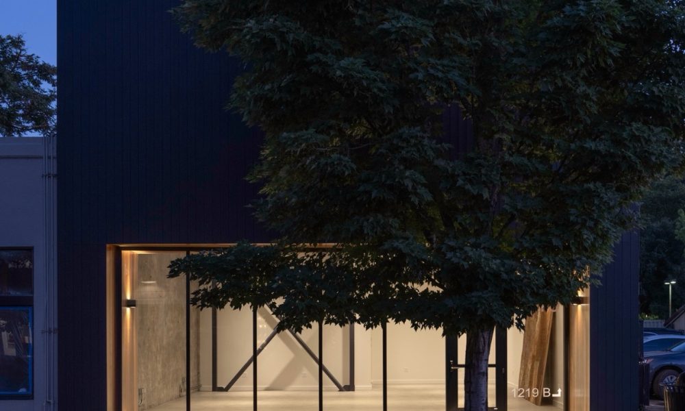
This project prioritizes sustainability and urban renewal at a small scale in downtown Calistoga. This 1,800 square foot reconstruction maintains the existing footprint of a former hair salon and transforms it into a leasable 1,300 square foot commercial space in the front, and a 500 square foot residential unit in the rear. The project significantly reduces its environmental footprint by preserving the century old existing concrete walls and redwood trusses, minimizing waste and resource consumption. Strategic installation of skylights introduce a layered approach to daylight. This fully electric building is designed with the goal of achieving net zero energy (NZE). This development supports small-scale urban density by reimagining existing spaces to enhance housing and appropriately sized commercial areas in the downtown region.
Commercial
Austin Energy Headquarters
By ELS Architecture and Urban Design (as Design Architect); Page (Architect of Record and Interior Designer)
Photography by Emphatic Creative Media & Peter Molick Photography
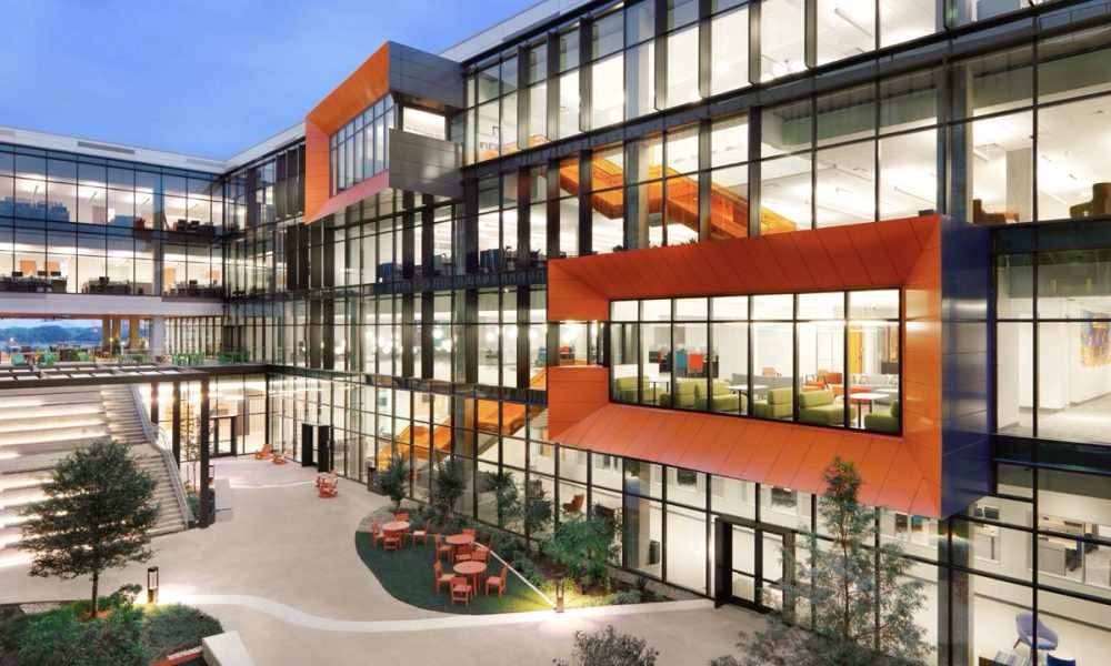
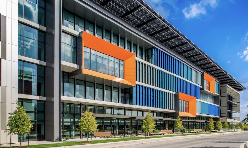
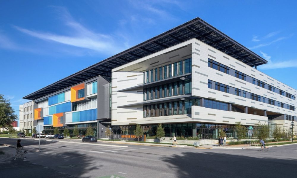
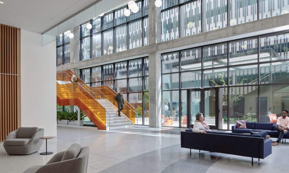
Designed as a new headquarters for the 1,000 employees of Austin’s forward-thinking municipal electric utility, this four-story, LEED Platinum- and WELL Platinum-certified office building is in Mueller, a LEED ND Gold neighborhood that was master-planned by this building’s design architect. Because the building spans a 400-foot “superblock,” the massing is broken into three volumes punctuated by varied glazing, a ground floor loggia, and other engaging, pedestrian-friendly elements; these volumes are visually united by a rooftop solar array that offsets the building’s carbon footprint, reduces heat gain, and demonstrates Austin Energy’s commitment to sustainability. Minimally used structural concrete and stringent water-demand reductions support resource conservation.
Booker Vineyard
By Signum Architecture
Photography by Adam Rouse Photography
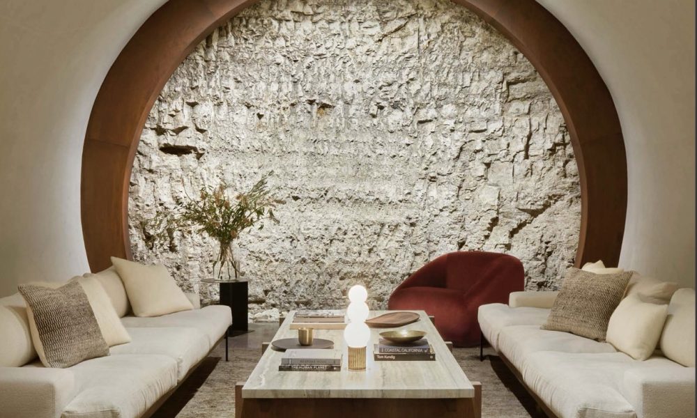
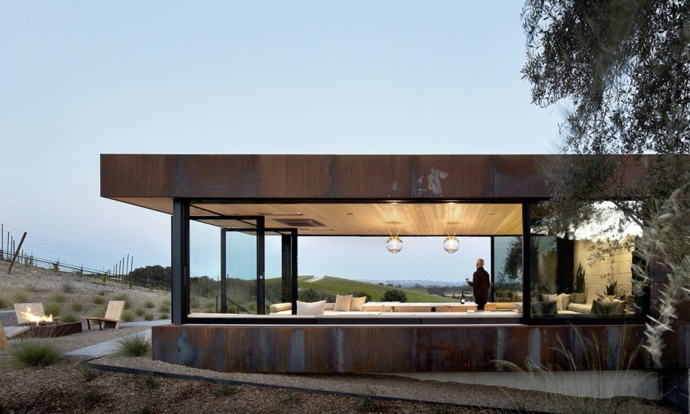
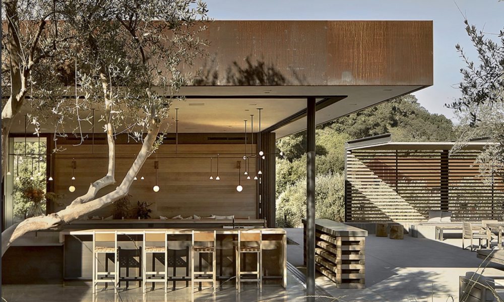
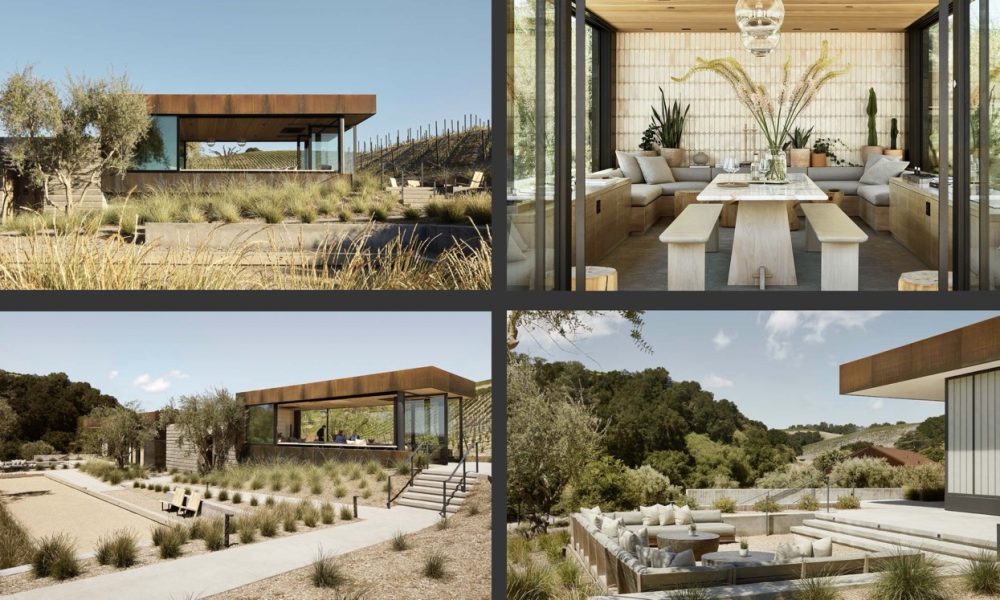
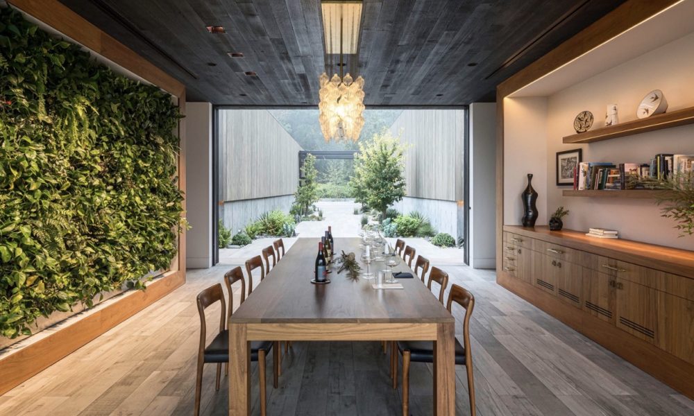
Our brief for this small winery hospitality structure in Paso Robles was to design a space that would embody the ethos of the winery’s distinctive brand and the charismatic per – sonality of its founder/winemaker. We took our cue from our client – a self-professed minimalist – and his belief that a fanciful winery and expensive gadgetry do nothing to make a wine – or a place – better.
Our goal was to embody this minimalist winemaking philos – ophy with a transparent, deeply integrated indoor/outdoor environment that sits lightly on the land, providing a casual, welcoming atmosphere for visitors that reflects our client’s love of entertaining. He had requested a place in the vine – yard to gather – essentially a terrace and trellis. So that’s where we started.
Rivers Marie Winery
By Asquared Studios
Photography by Adam Potts Photography
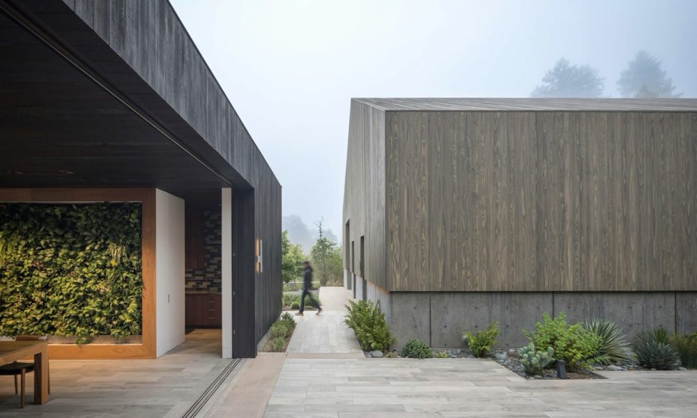
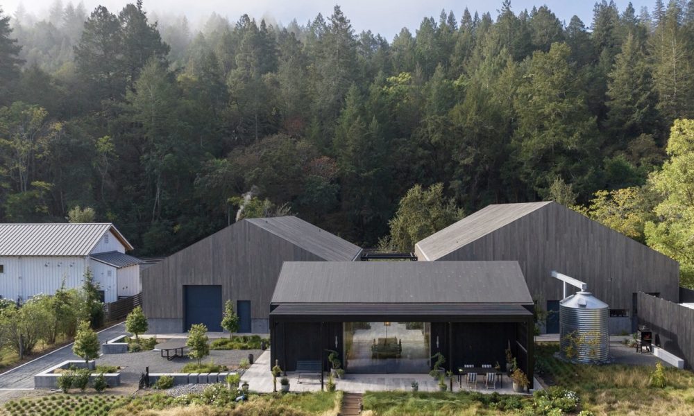
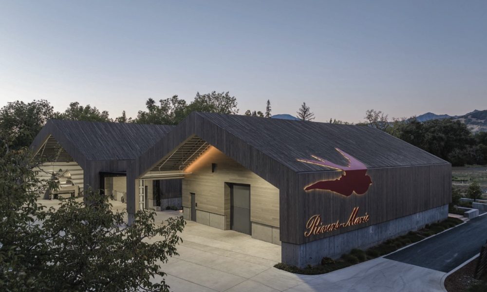
Inspired by the locale, the winery puts a modern twist on the California Barn aesthetic with its campus-style arrangement of buildings, canopied loggia, and curated wood clad exteriors. Fronting a rural highway, the geometric forms make a stark silhouette against the pastoral landscape. Simple and unadorned, except for the label’s red swallow logo that swoops down the facade, the design carefully frames views of the Palisades Mountain Range while embracing the bucolic setting. Although the winery makes a strong statement from the street, pitched roofs, the smaller-scaled cluster of buildings, and naturally-lit and ventilated spaces evoke the countryside’s simplicity.
Institutional
Brisbane Library
By Siegel & Strain Architects
Photography by Cesar Rubio Photography
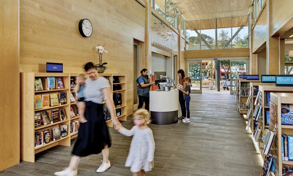
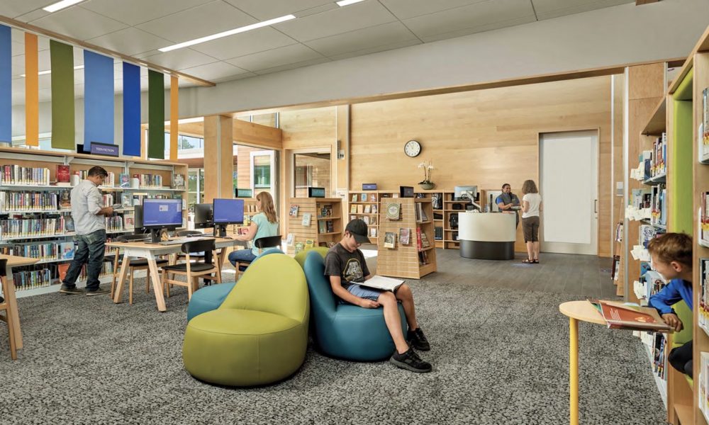
As Brisbane’s shared living room, the library is organized along a sunlit hall that connects the main entry to an enclosed garden.
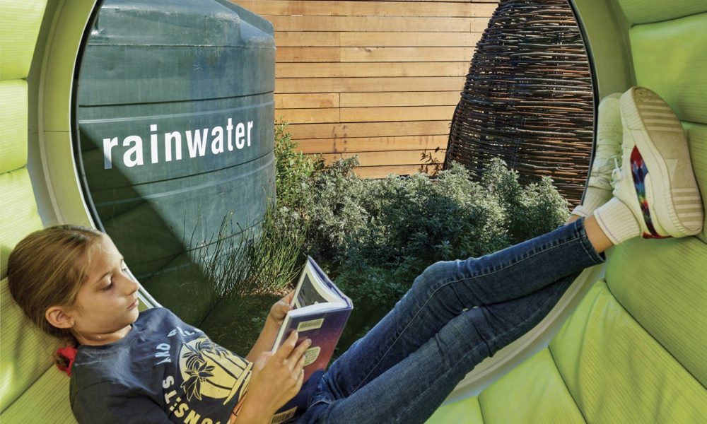
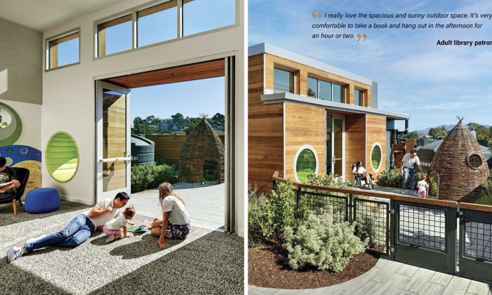
The main reading room and quiet room perch on a front terrace overlooking Brisbane’s main street. The teen room is furnished with movable tables and chairs for afterschool programs. The children’s space offers a reading nook, butterfly-eye window seats, and bifold doors that open into a secure garden. The community room has its own public entry for after-hours use. This wing, including a maker space, is divisible into smaller areas and expandable into the garden.
College of Marin New Miwok Center
By ELS Architecture and Urban Design
Photography by Lawrence Anderson Studio
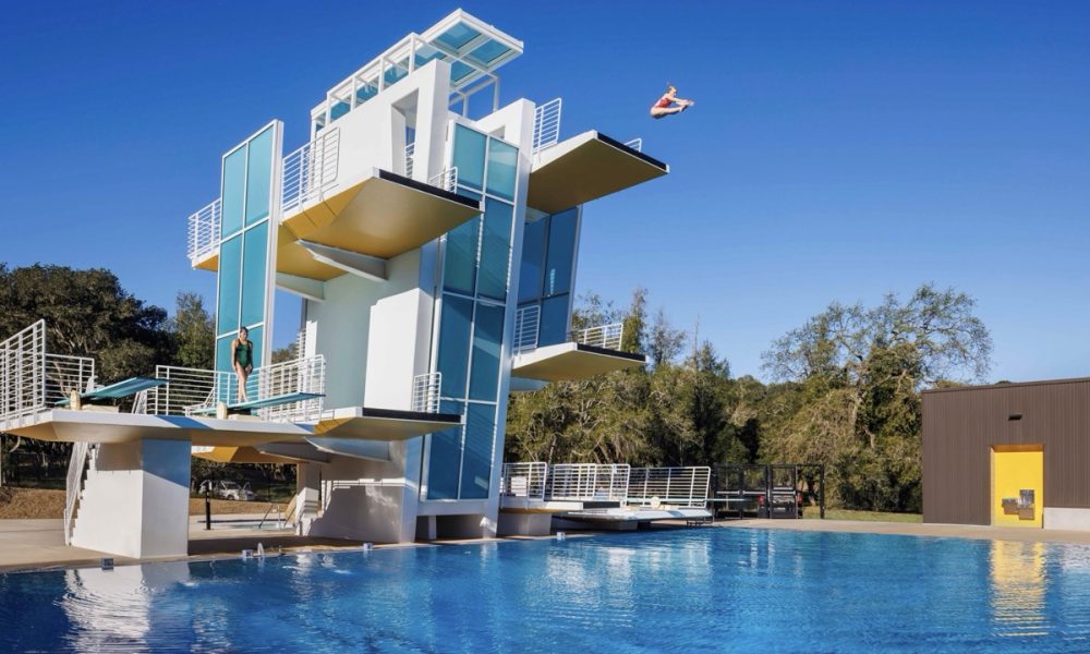
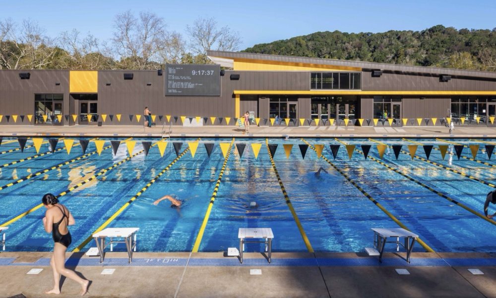
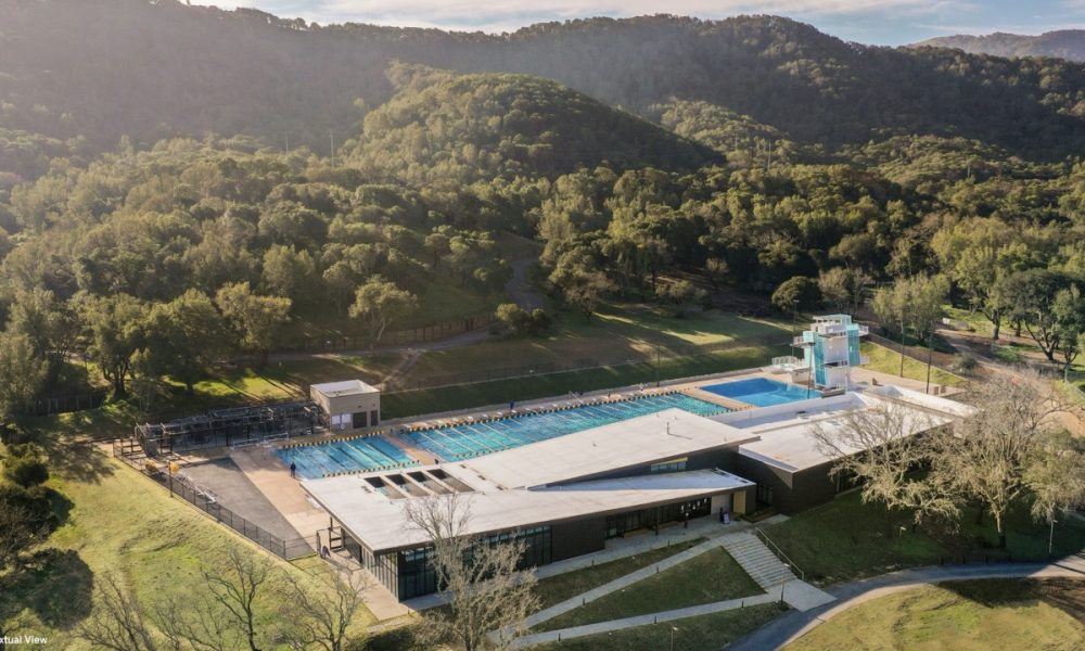
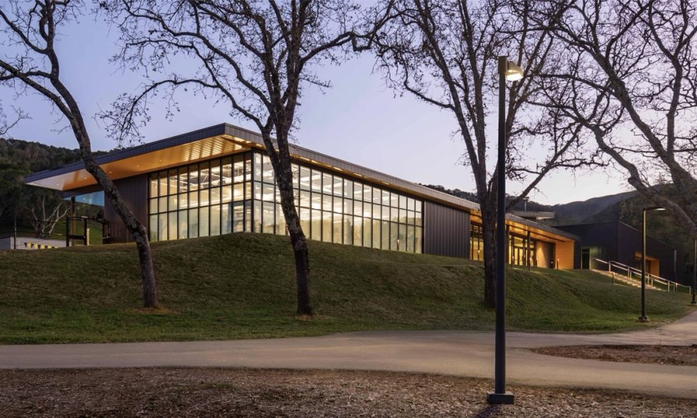
Nestled into a hillside at College of Marin’s idyllic Novato location, this new, highly visible recreation and aquatics center replaces a deteriorating pool building and, alongside student use, generates revenue for the District through public memberships.
The College of Marin’s 333-acre second campus suffered from a lack of community awareness, despite its establishment in 1985. District leaders sought to use this project to revitalize the campus core, highlight the site’s beauty, and affirm their public commitments – all while welcoming wellness, kinesiology and physical education students alongside paid public members.
College of the Redwoods Creative Arts
By tBP/Architecture
Photography by Pablo Mason Photography
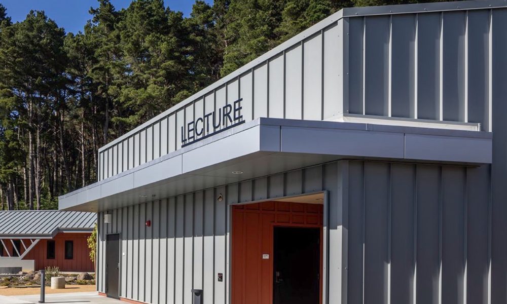
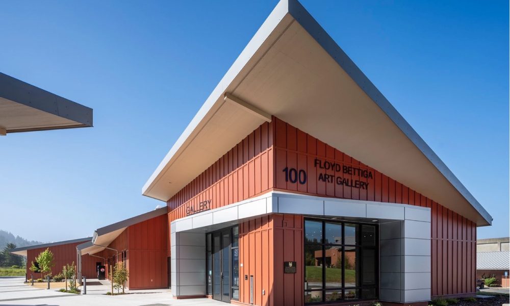
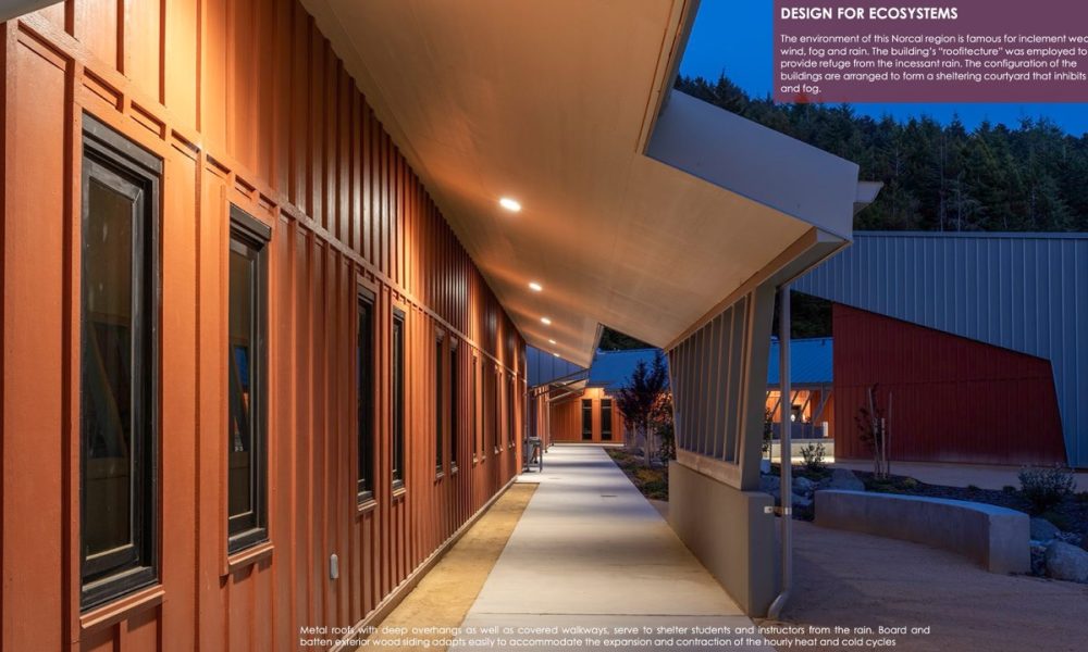
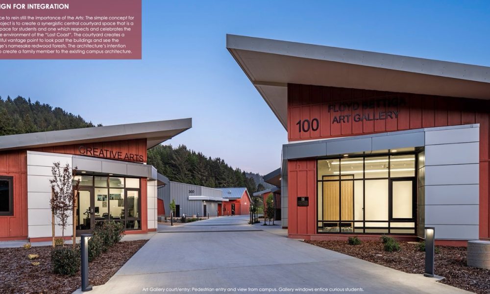
This project was initiated as the result of damage occurring to the existing buildings from reoccurring seismic activity in the region. Upon investigation, a striated set of faults were discovered leading to the necessity of demolishing 2/3 of the original campus. Further investigation led to creating “safe zones” where new campus buildings could be constructed. Subsequently, a Campus Master Plan organization was conceptualized as a string of pearls linking the various replacement buildings together. We saw this as an opportunity to initiate a new typology for this campus; to create a courtyard building (like the Colleges that form Cambridge University) along this string of pearls. This organization allowed us to create a building complex formed to encompass an outdoor space to be used by students to study, collaborate, gather, socialize and create a feeling of belonging.
Interiors
OpenText San Mateo
By HOK
Photography by Tom Arban Photography, Inc.
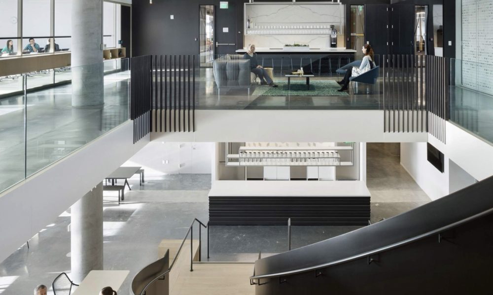
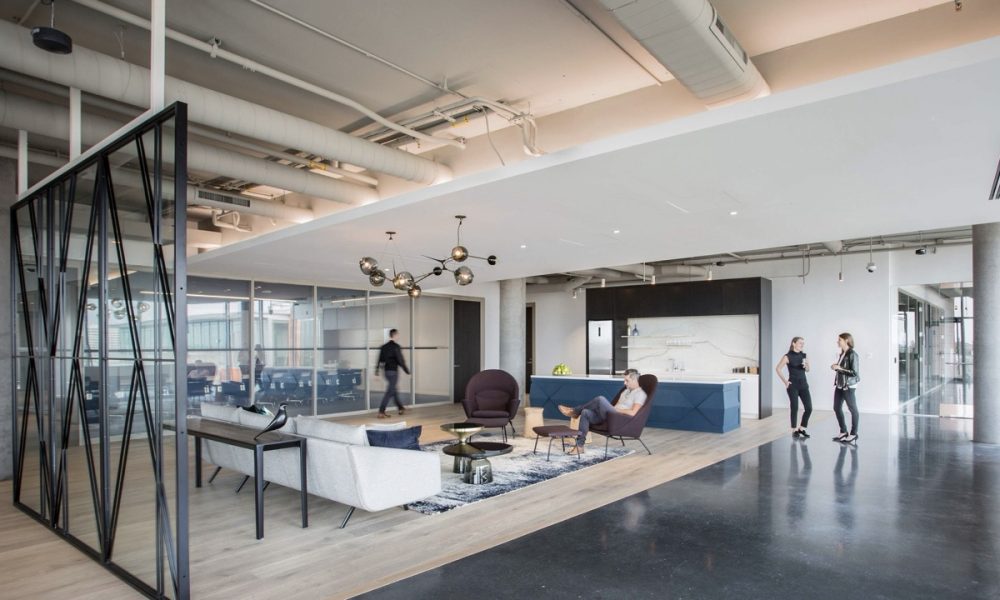
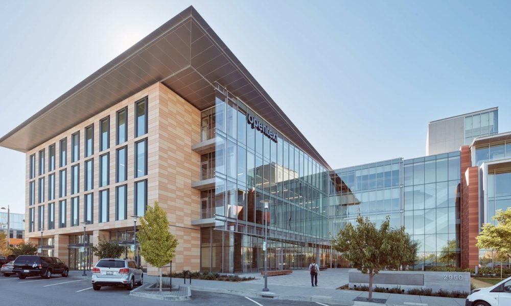
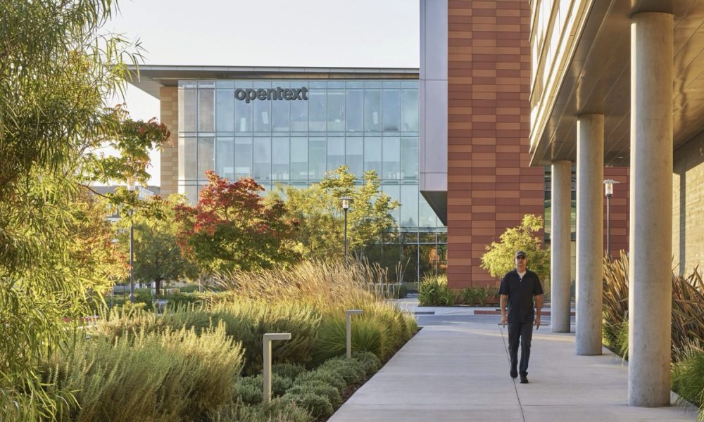
Located in a new, LEED Gold-certified commercial office building in Bay Meadows, San Mateo, OpenText’s Bay Area office is more than just a place for people to shape the digital future of business information. It is a space arranged to promote employee wellbeing and facilitate social interactions and the mixing of ideas. Serving as a crucible for the firm’s culture and a physical manifestation of the brand, the workplace firmly establishes OpenText as a sophisticated, world-class technology company.
The Caffè by Mr. Espresso
By jones | haydu
Photography by Matthew Millman Photography
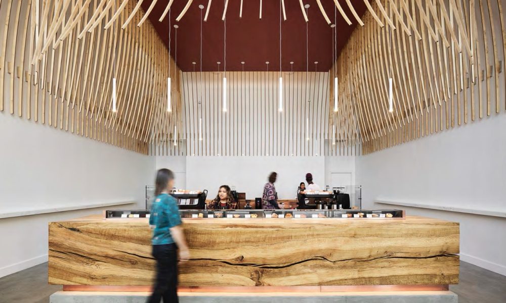
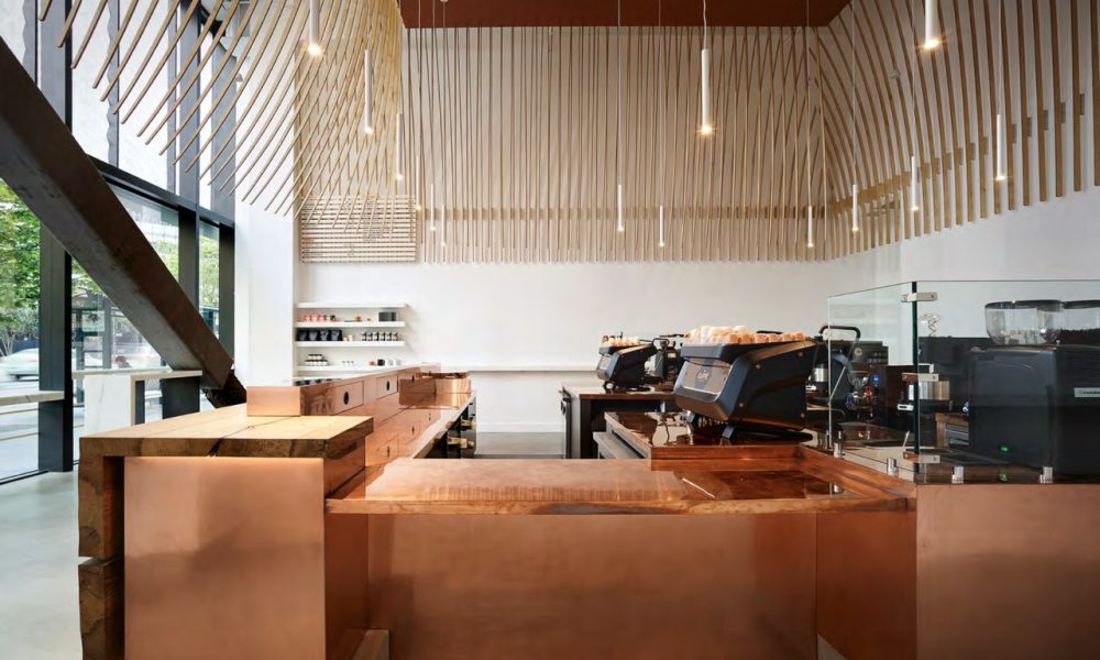
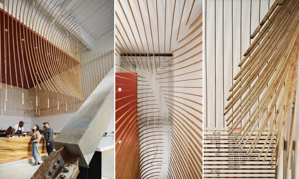
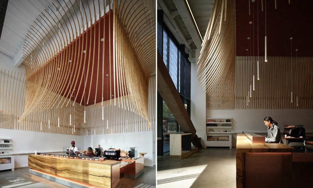
Informed heavily by Italian cuisine, which is masterful at creating great complexity with minimal ingredients, we chose to minimize the number of materials used, and to celebrate their innate richness. Crafted from slabs of a single white oak tree that fell in Sonoma in 2008, the primary bar frames nature as the focus. The perimeter of the caffe hosts a Calacatta marble ledge, a nod to Italy’s most ubiquitous, yet luscious, materials. Behind the bar, hand polished copper contrasts with the organic nature of wood and stone. The Italian notion of contrast, “chiaroscuro”, provides further inspiration. Overhead, wood is used in a diaphanous fragile manner in contrast to the heavy stable oak bar. Highlighting the verticality of the space, it is a gestural move to provide both monumentality and intimacy; to form both an object (from outside the bar) to a space (once underneath). From some angles it is airy (chiaro); from others it is quite solid (oscuro). Though the shapes and fabrication process are modern, it is a nod to the domes and arcades of the Renaissance and Baroque periods.
Large Civic
City of Fremont Downtown Event Center
By STUDIOS Architecture
Photography by Kyle Jeffers Photography & SWA Group
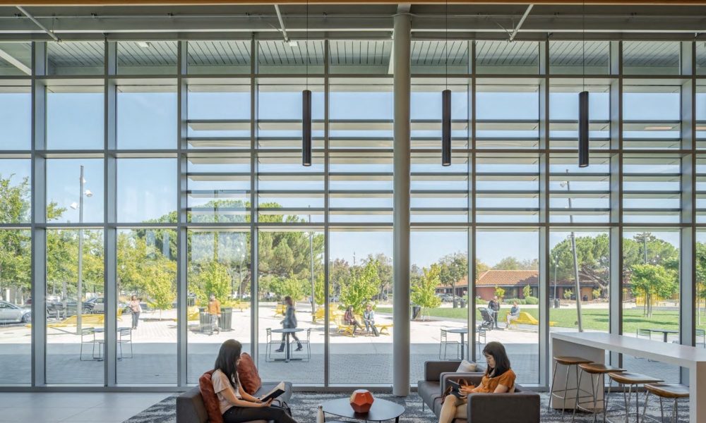
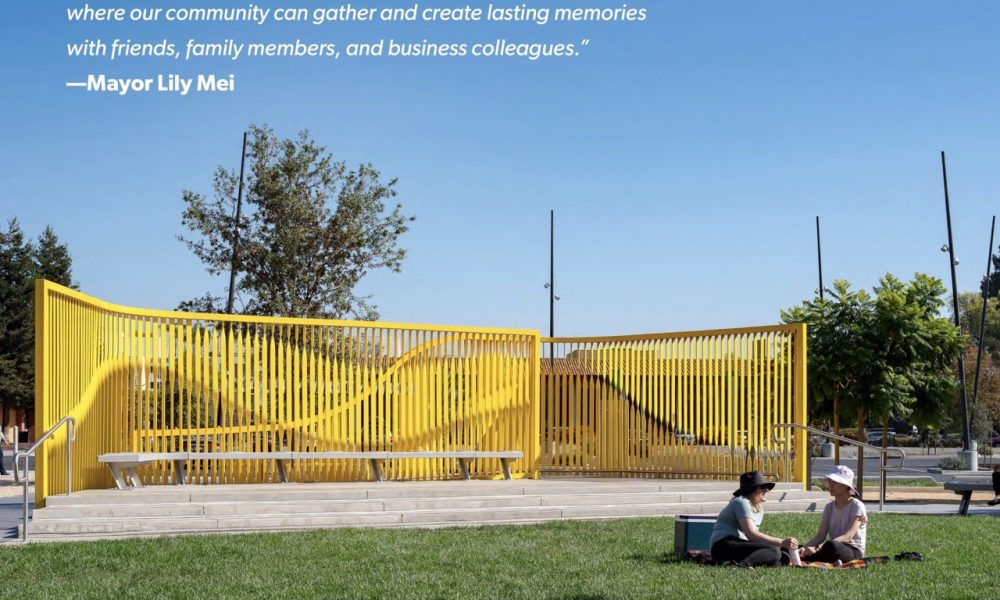
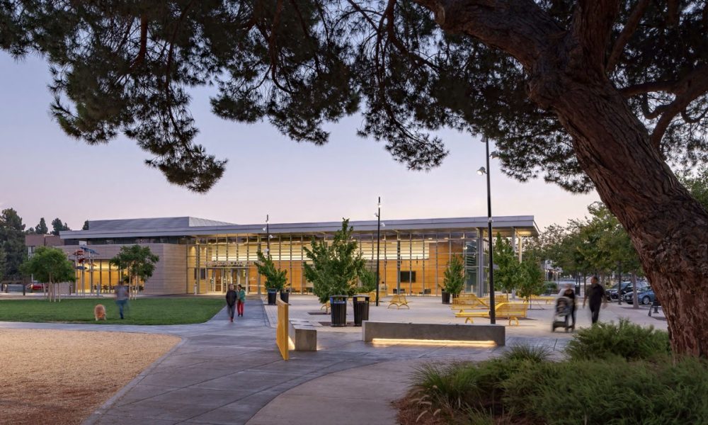
The Downtown Event Center and Plaza form a new social heart for the City of Fremont, which is the fourth largest city in the San Francisco Bay Area. The project is the first completed phase of construction from the design firm’s master plan for the City’s new Civic Center campus at the heart of Fremont’s new Downtown District. This all-electric facility includes a significant photo voltaic array, ultraefficiency fixtures and equipment, and a high-performance envelope with significant daylighting throughout.
Oakland Museum of California
By Mark Cavagnero Associates
Photography by Tim Griffith Photography
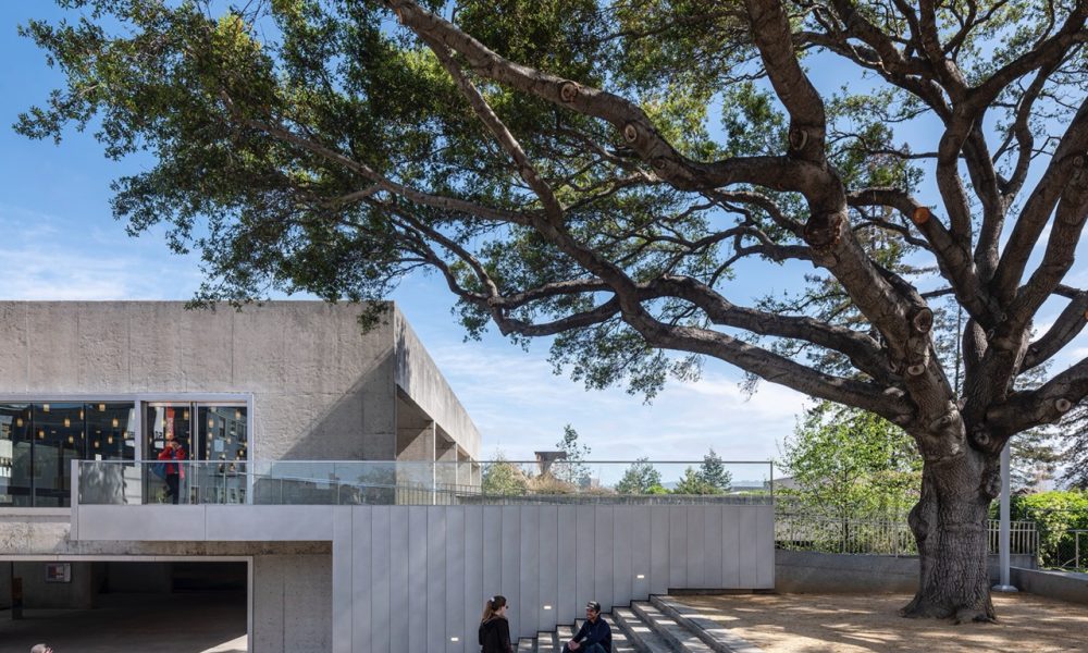
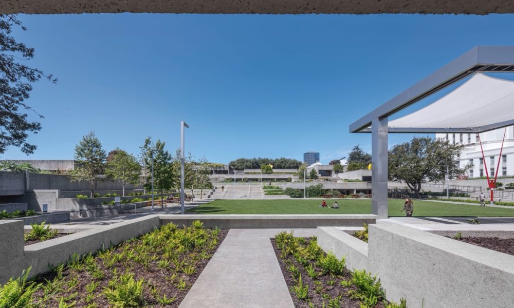
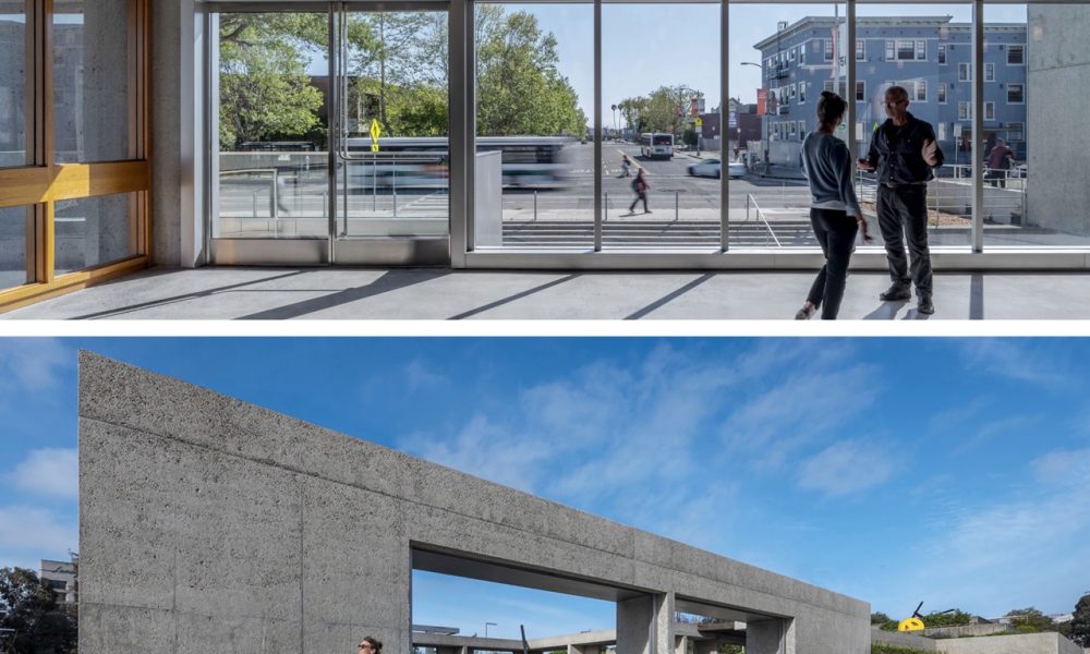
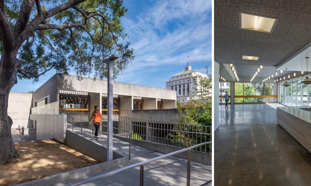
“Small Change – Big Impact” is how the Oakland Museum of California (OMCA) describes the recent garden and café renovation. Through a series of reductive moves the project opens the Museum to the surrounding neighborhood strengthening engagement and access while supporting the Museum’s mission as a community-centered organization.
Mixed-Use
Bay Meadows
By HOK
Photography by Bruce Damonte Photography
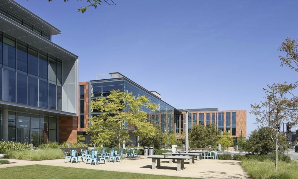
Bay Meadows is a new mixed-use commercial destination along the Caltrain line in the heart of San Mateo. The development features a pedestrian-friendly environment with ample parks and green spaces, sustainable office buildings and a variety of housing types. To minimize the need for cars, the design establishes a framework of streets, bike paths and walkways that provide convenient access to the Hillsdale Caltrain Station. The five single-block, mixed-use office buildings serve as the village’s economic engine.
Mayfair Station
By Lowney Architecture
Photography by Hunter Kerhart Architectural Photography
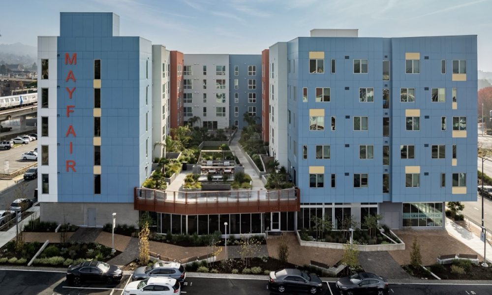
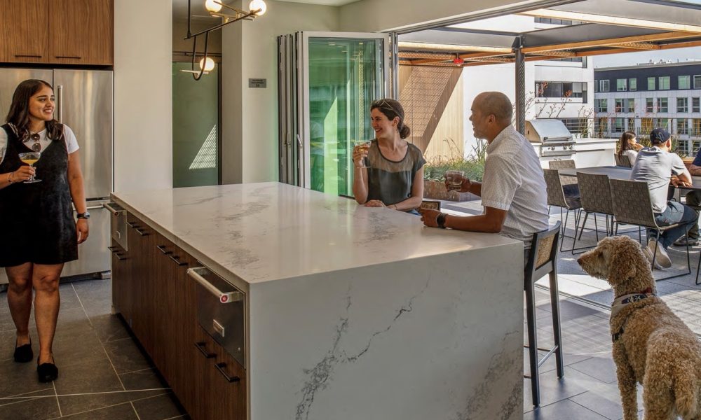
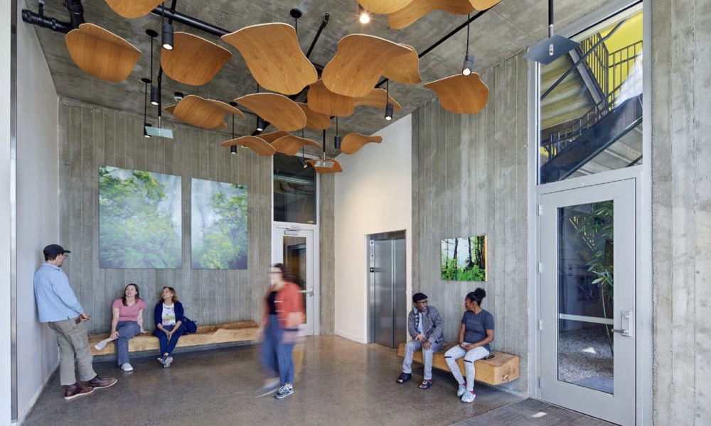
Mayfair Station in El Cerrito, CA, was designed to transform a neglected stretch of San Pablo Avenue into a vibrant community hub. The building’s proximity to BART, bus hubs, and the Ohlone Greenway offers convenient and healthy transportation options. It promotes a walkable lifestyle with ground-floor community spaces, street-facing retail, and a public mews that encourages social interaction. Universal design principles ensure accessibility for all ages and abilities, while shared spaces like the courtyard, fitness center, and lounges foster a sense of communit
Modera Lake Merritt
By WRNS Studio
Photography by Matthew Millman Photography
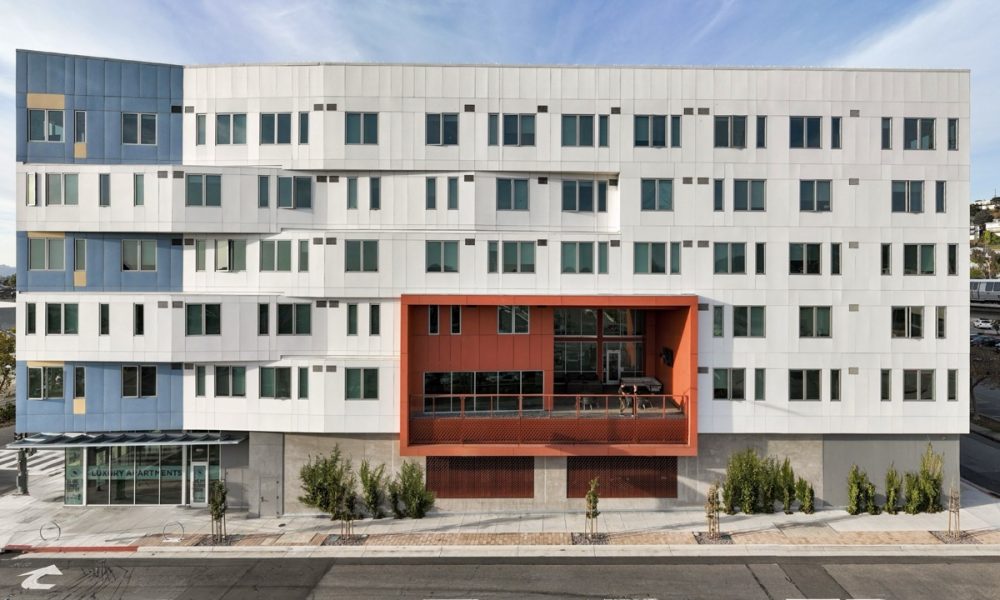
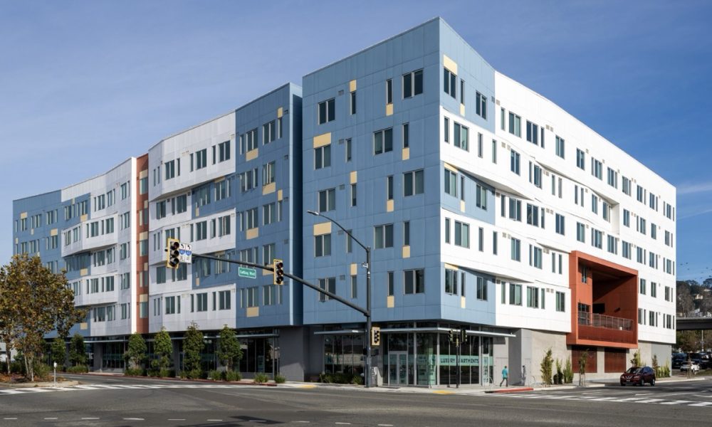
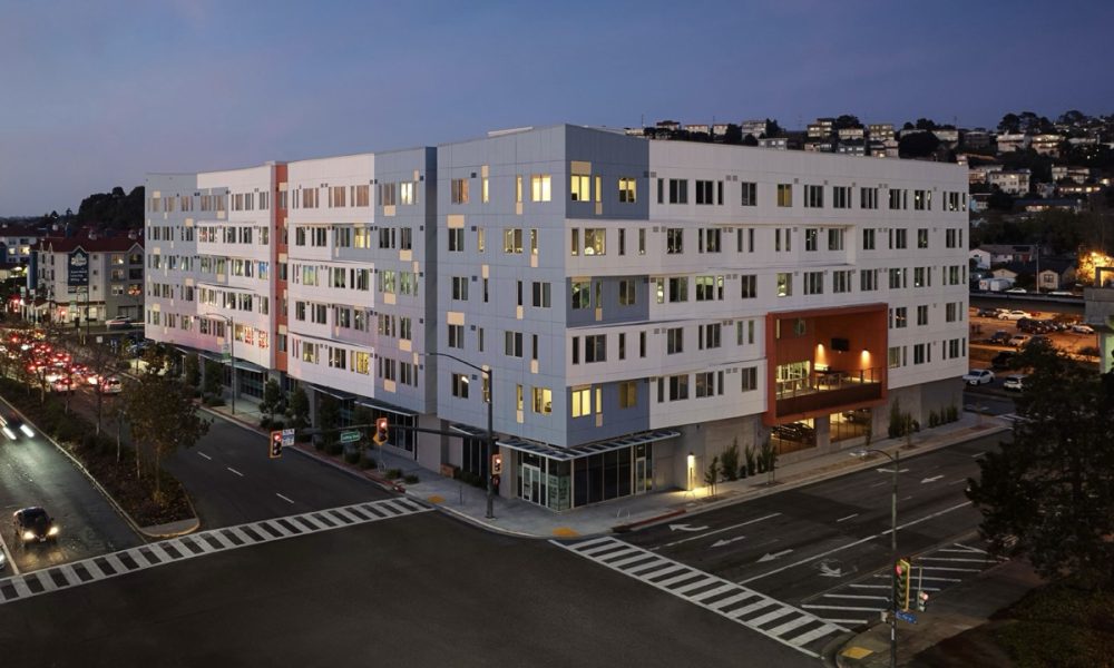
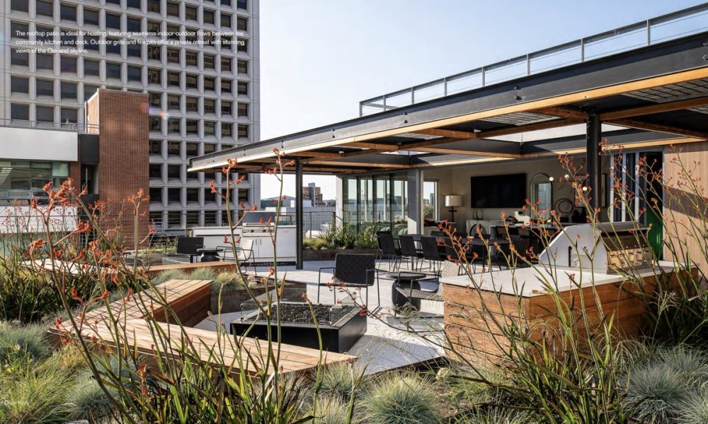
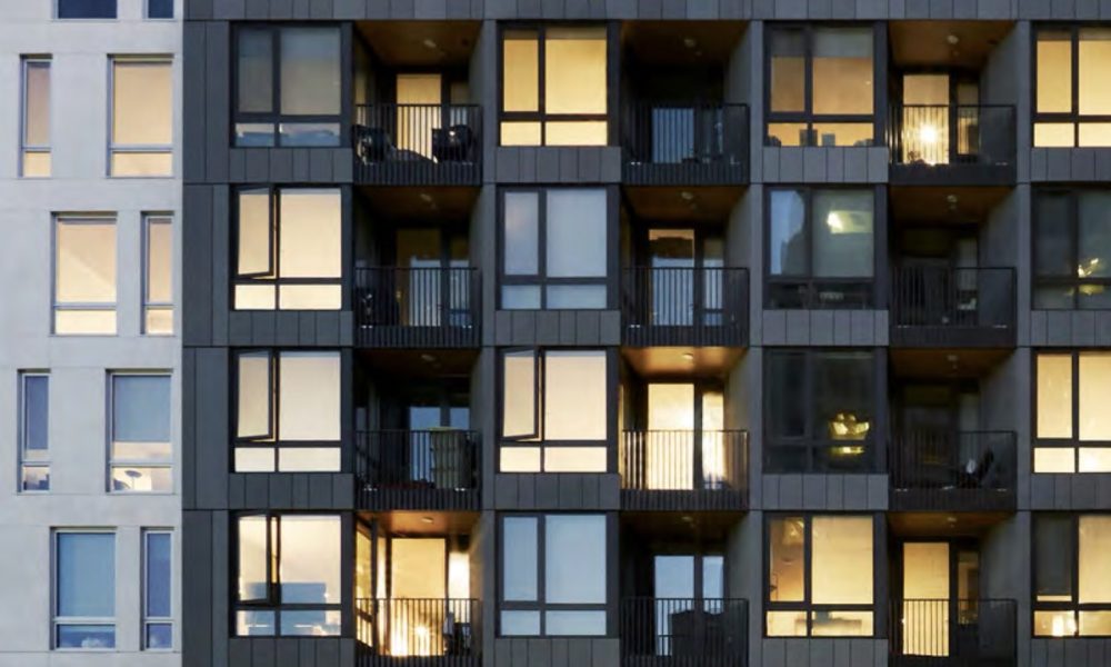
Oakland’s vision for Downtown is clear: more housing, a healthy community, and a richer urban experience, to name a few objectives. In the last decade, Downtown Oakland has emerged as a thriving, mixed-use neighborhood—one that honors its deep-rooted history while embracing progress. Modera Lake Merritt, a new mixed-use urban infill development, directly addresses the critical need for housing while helping stich together the fabric of the city.
Strategically located between Lakeside and Uptown, Modera Lake Merritt bridges longestablished and emerging communities, offering proximity to both new and legacy businesses. This development also sits at the crossroads of culture and convenience, with quick access to public transit, retail hotspots, and iconic destinations like the Fox Theater and nearby greenways. But Modera isn’t just about location and housing—it’s about energy. Day and night, Modera Lake Merritt activates the street, transforming the surrounding area into a walkable, vibrant neighborhood.
Multifamily
AB(C)D Housing
By Baran Studio Architecture
Photography by Benedicte Lassalle Photography
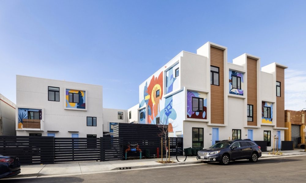
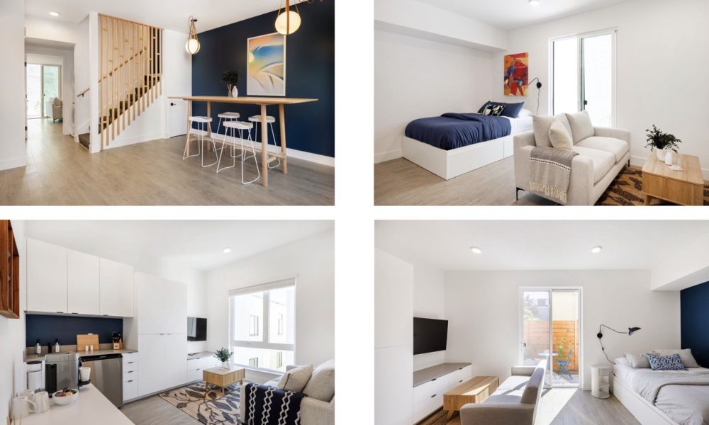
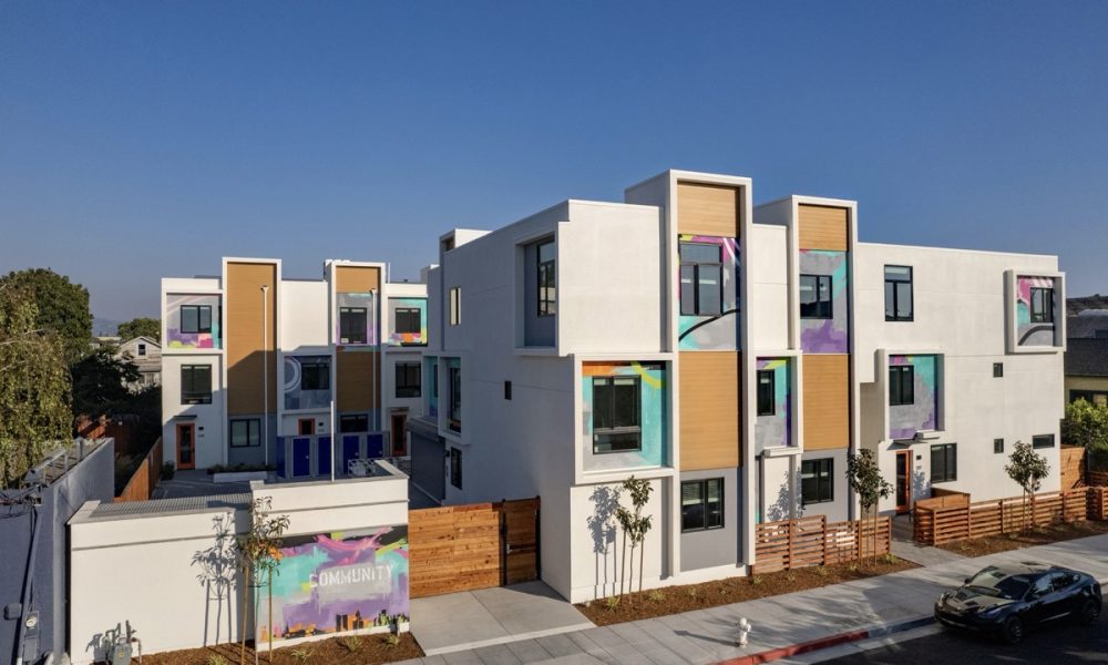
The AB(C)D Housing system, standing for “Affordable by Collective Design,” represents a systematic approach to tackling the housing crisis through a deployable, cost-effective design model. Implemented across multiple sites, including ArtHouse Six and ArtHouse Magnolia in Oakland, this system has proven its potential to reduce housing costs by increasing production, offering an innovative solution that can be replicated across other sites to meet the growing demand for affordable housing.
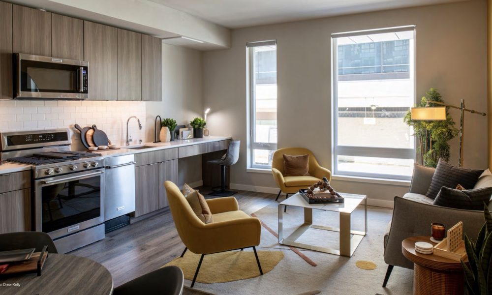
Both sites provide affordable, high-quality residences tailored for the “missing middle”—a group that includes essential community professionals, such as teachers, firefighters, and first responders, who are often priced out of traditional housing markets. They deliver a mix of suites featuring private kitchenettes, storage, and natural light, designed to support both comfort and affordability. The projects prioritize community with shared spaces that foster connection among residents, promoting a sense of belonging.
Coliseum Place
By David Baker Architects
Photography by Bruce Damonte Photography
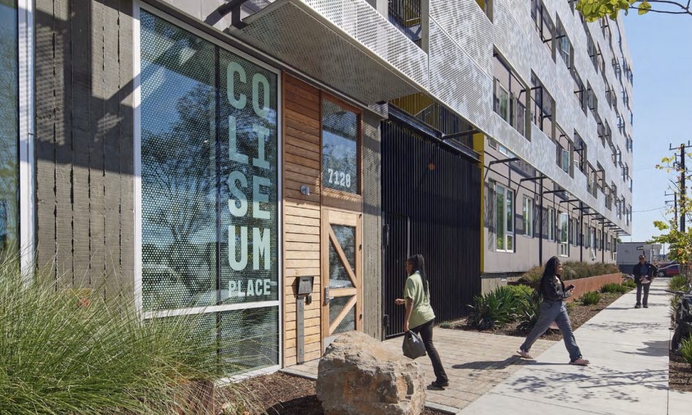
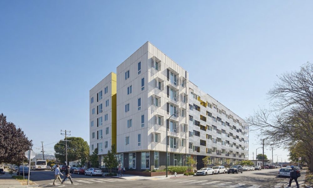
Coliseum Place brings affordable homes, on-site social services, and green space to a historically underserved neighborhood in East Oakland. Adjacent to the Coliseum BART station, this transit-oriented community sits between a residential neighborhood and BART parking lot, reclaiming a formerly industrial site that faced a series of urban challenges ranging from illegal dumping to unsafe pedestrian access and insufficient open space.
Coliseum Place transforms a severely underutilized contaminated site into a vibrant community of 59 family homes that meets the definition of a zero-emissions building while also embodying the principle of discovery—serving as the subject of several research studies that advanced sustainable design best practices for affordable multifamily housing without imposing burden on low-income residents.
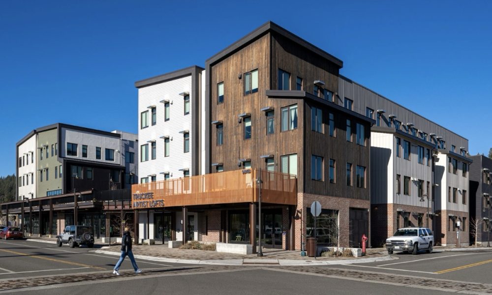
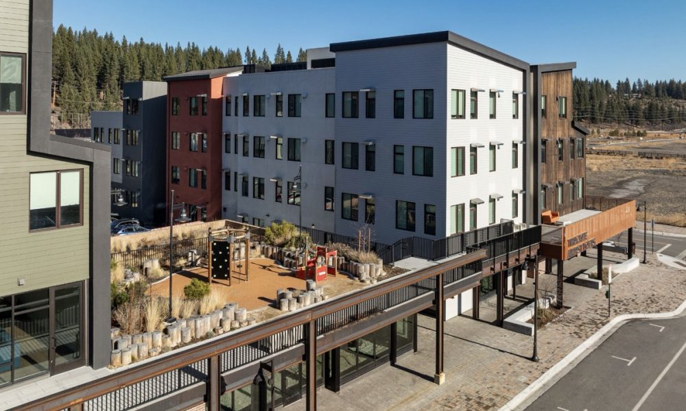
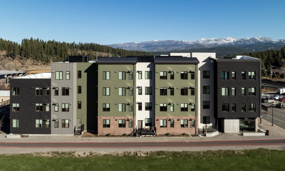
Truckee Artist Lofts
By Lowney Architecture
Photography by Hunter Kerhart Architectural Photography
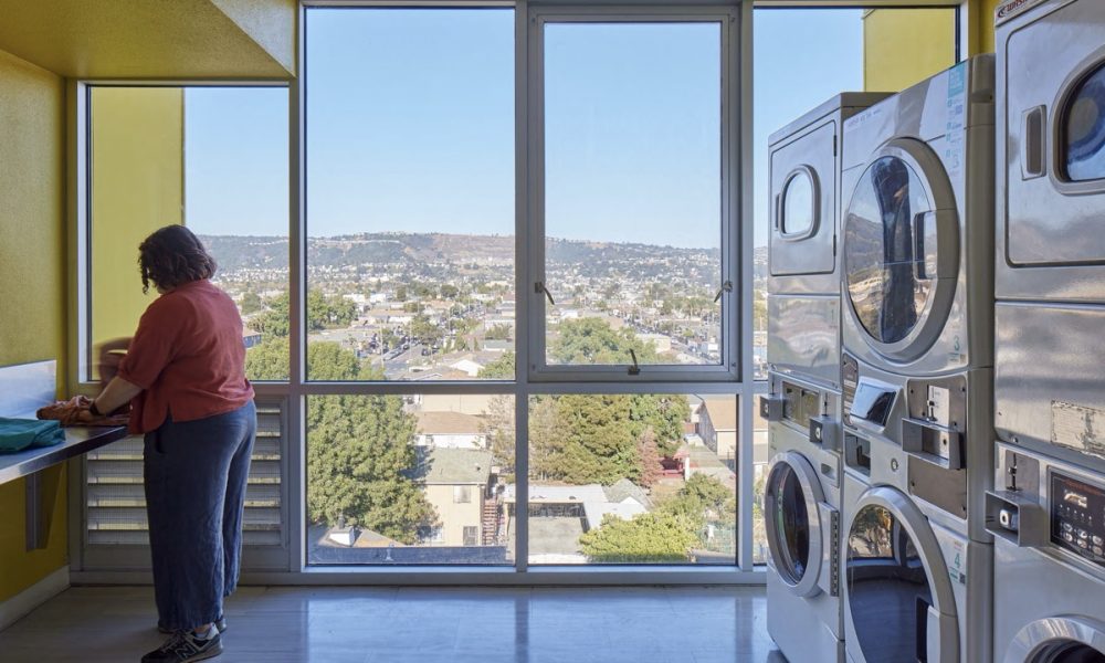
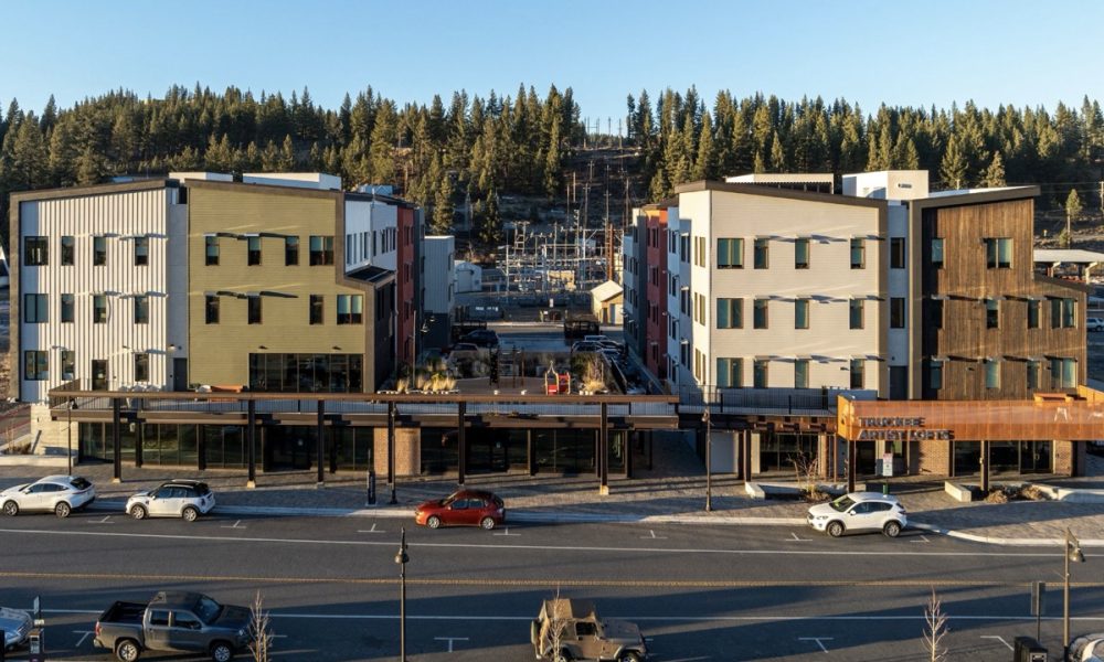
The Artist Lofts in Truckee is a 4-story mixed-use development featuring 77 affordable live/work units for local artists. Situated in the heart of Truckee’s Railyard, the project also includes 3,735 square feet of ground-level retail space, contributing to the vibrancy of downtown Truckee and extending its community feel eastward. The Lofts are designed with artists in mind, offering amenities like art studios, a second-floor music room, and communal spaces for residents, including two laundry rooms and a community room.
Single Family
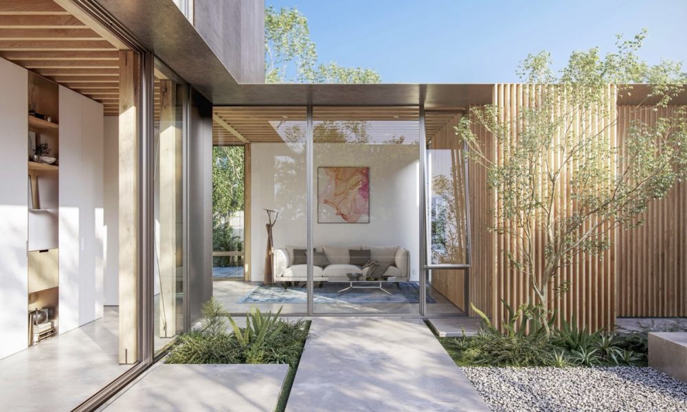
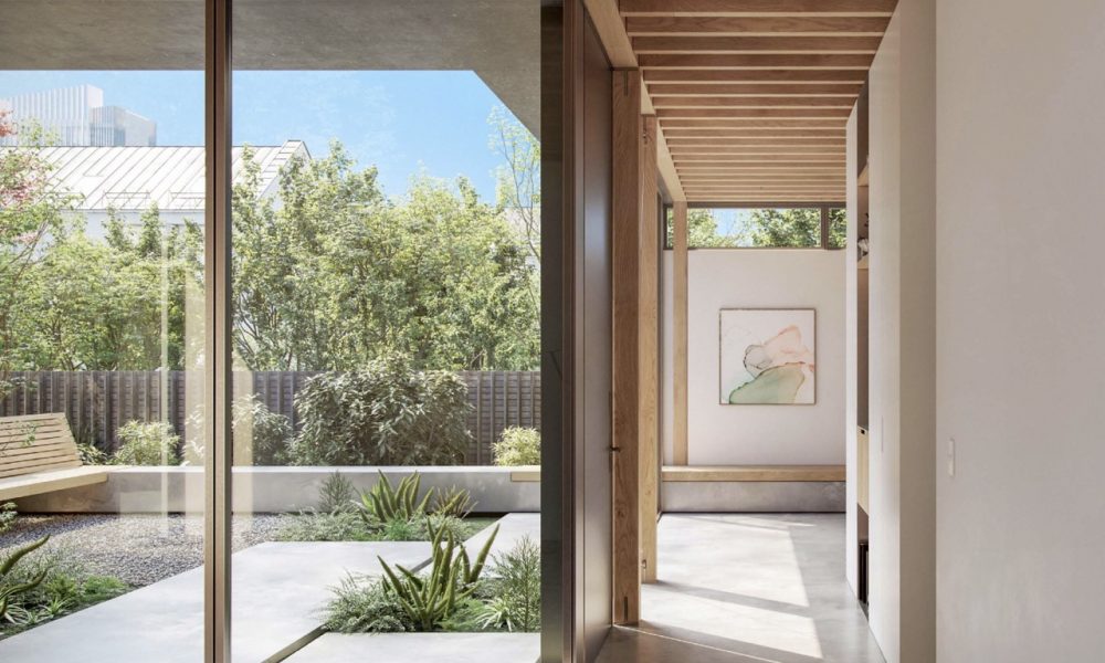
Healdsburg Knoll
By Turnbull Griffin Haesloop Architects
Photography by David Wakely Photography
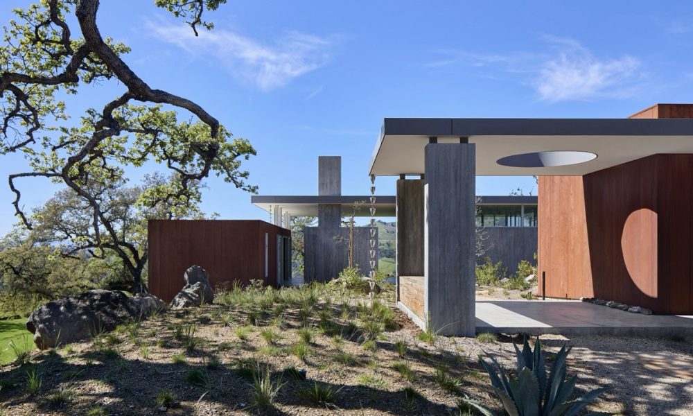
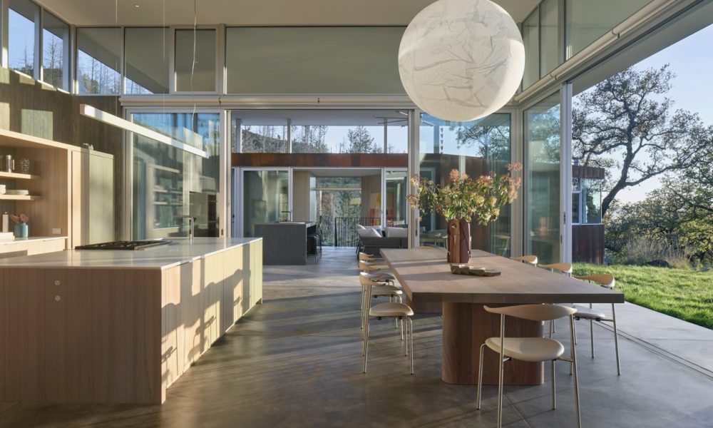
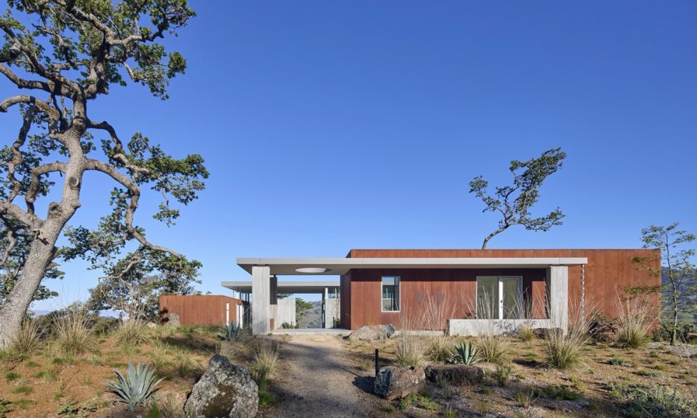
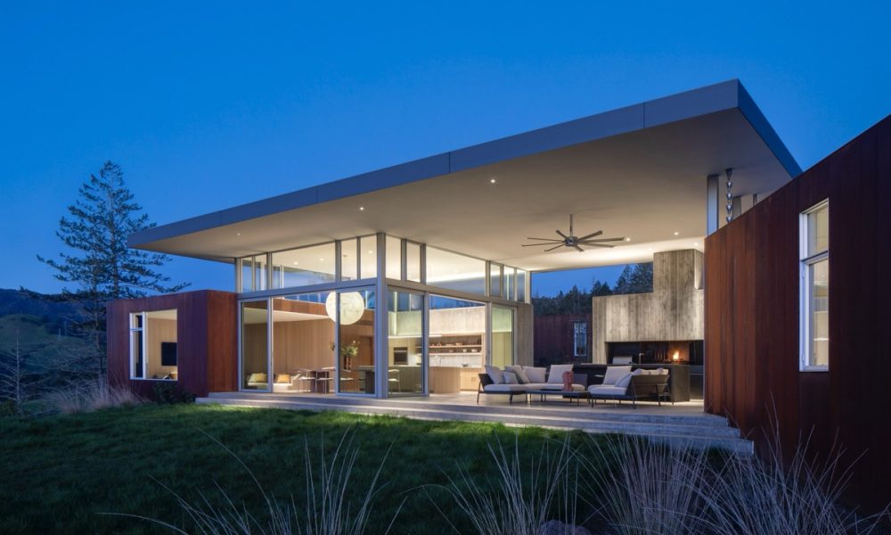
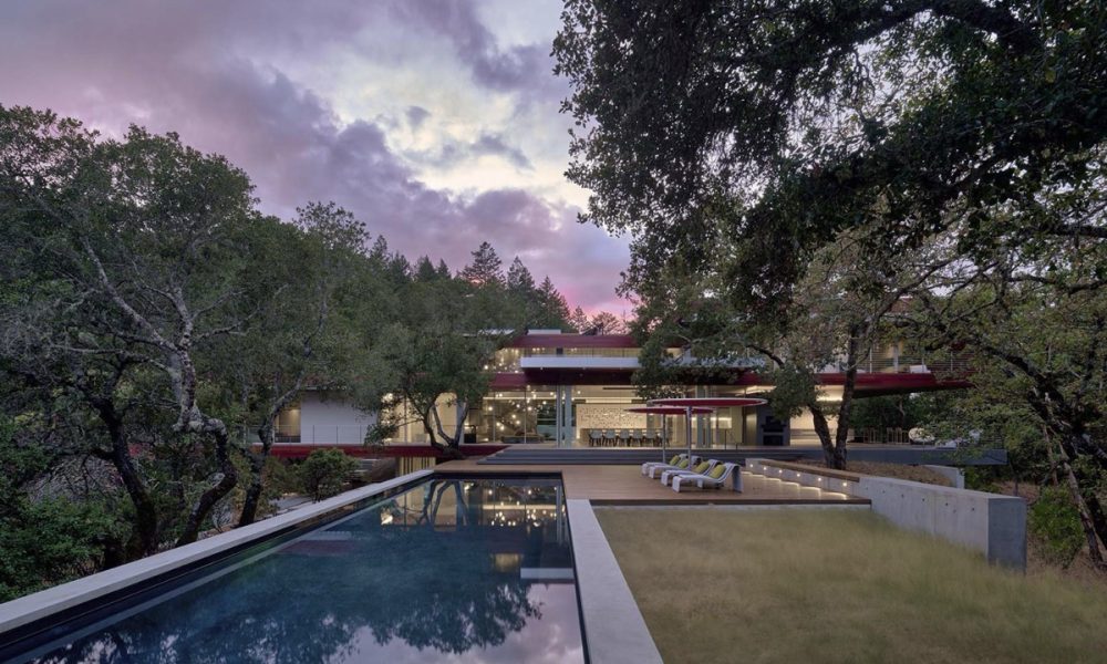
Located in a remote area of Sonoma County, the house is sited on a knoll surrounded by sloping land including steep canyons and oak meadows below. We wanted to preserve the legibility of the landform on this topographically special site.
The owners requested that the design of the new compound for their extended family incorporate their desire to live outdoors as much as indoors and to create a sense of procession up and over the knoll, allowing for spaces and vistas to distant slopes and valleys to unfold.
Nest House
By Collaboration of Timbre Architecture and CB Architecture + Design
Photography by Peter Lyons Photography
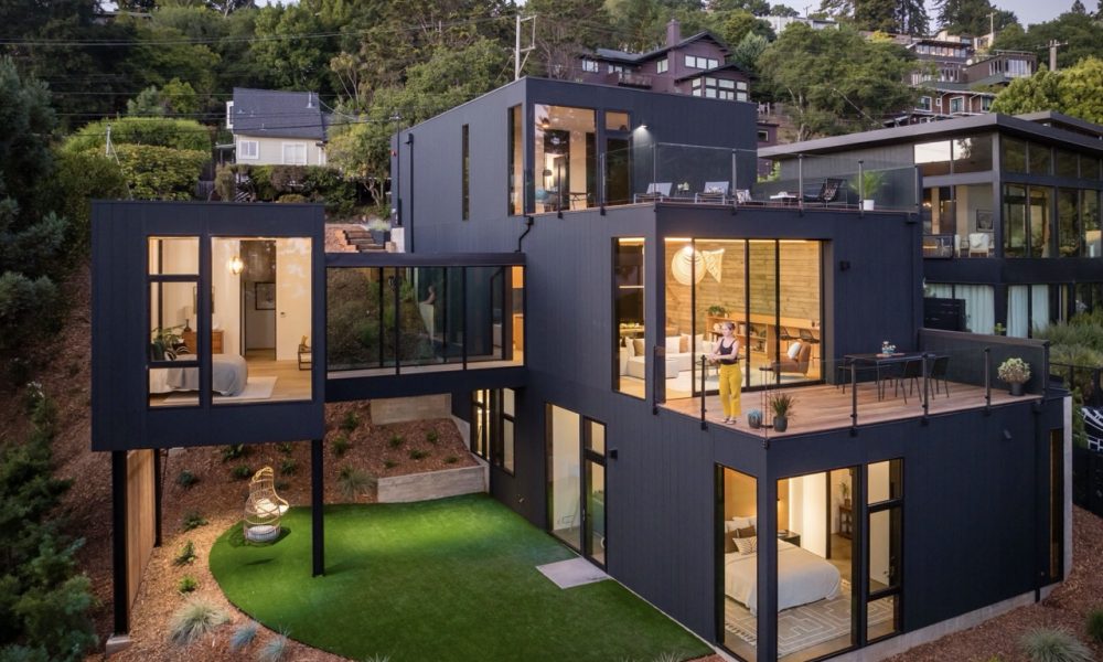
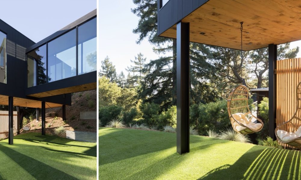
Nest House creates opportunities for occupants to engage with their environment on both conscious and unconscious levels. Vignettes from every level engage the senses, from observing butterflies fluttering around the roof garden, smelling the foggy marine air, watching cargo ships unload at the Oakland port, and listening to the birds chirp closeby and the city buzz below. At the ground floor the family room opens to an outdoor yard below the bridge and playful swings underneath the nest wing. Looking up from the swings one enjoys the visual warmth of knotty cedar planks, milled from a cedar tree that had to be removed for construction; a subtle reminder that resources should be considered with care. From above, the floating bridge and nest wing provide a delightful architectural experience from all vantage points, using form, elevation and transparency to create the sense of being in a treehouse nestled amongst the foliage. Light plays along the board-formed concrete wall anchoring the east side of the home throughout the day, providing occupants with a visceral experience of the passage of time. Each of these moments, along with countless other design details and material choices, evoke a sense of home and encourage a deeper appreciation for the community beyond.
Piedmont Mid Century
By Turnbull Griffin Haesloop Architects
Photography by Jennifer Hughes, Photographers LLC
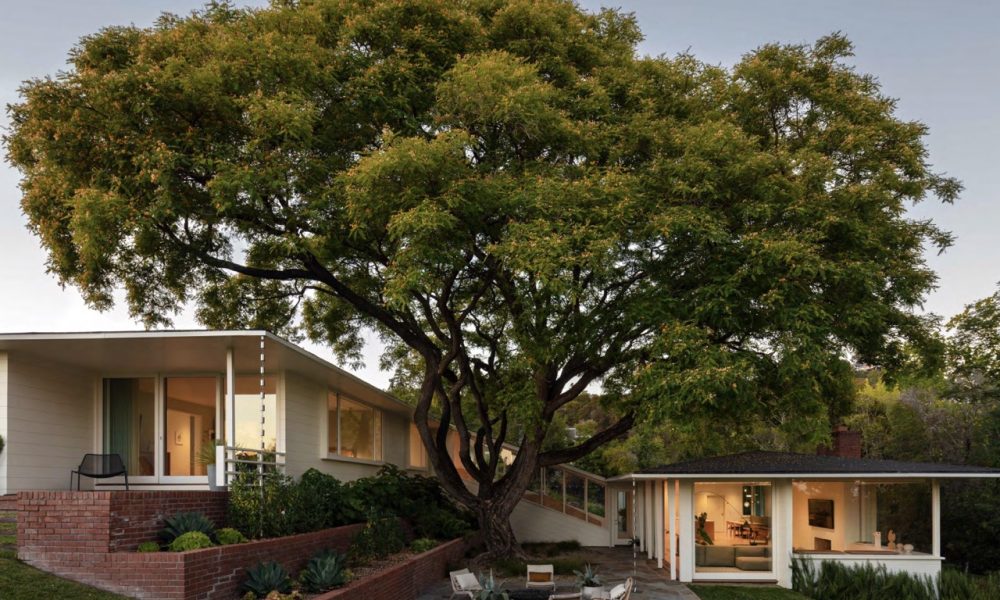
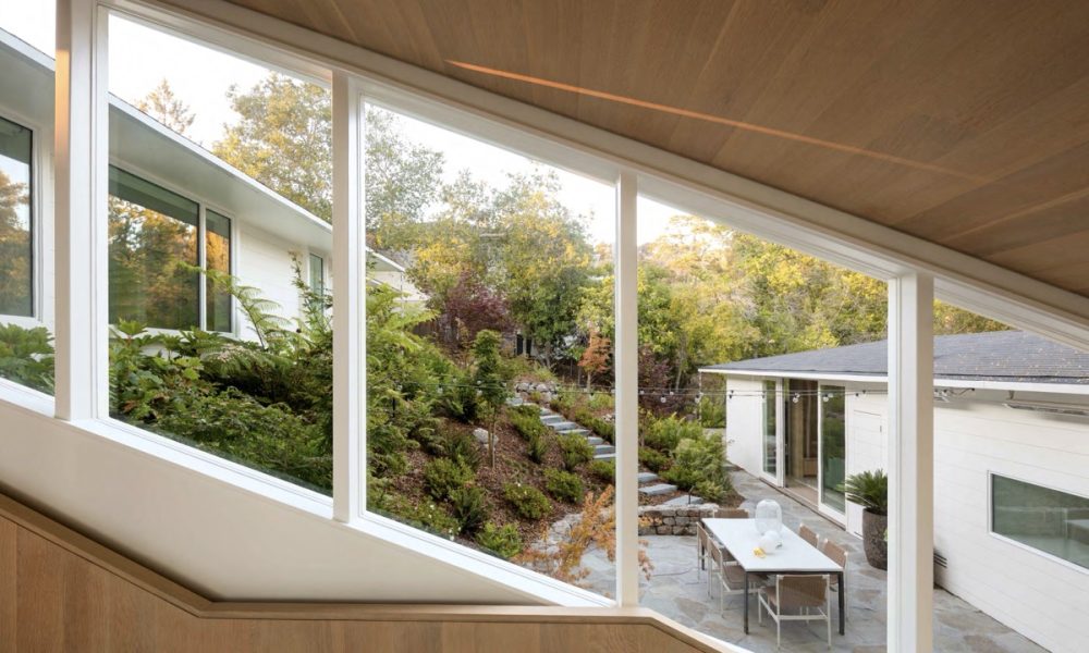
The existing house is one of the few mid-century modern houses in Piedmont, California. Designed by Clarence Mayhew in 1947. Through careful design insertions and structural stabilization, we were able to save the structure and give this 1940’s building a new lease on life. Programmatically we opened the many small rooms up to create a more informal living, dining, and kitchen area. We added an accessory dwelling unit where the old laundry yard had been. Our architectural response was to adjust the plan only as needed for the new more open layout with oak paneled insertions at the stairs and ceilings signifying where we adjusted the flow of space. The wooden stair ceiling follows the roof line and slopes up over the kitchen to reveal the framing and to balance the daylight in the center of the space.
Whispering Stones
By Swatt+Partners (formerly Swatt Miers Architects)
Photography by Tim Griffith Photography
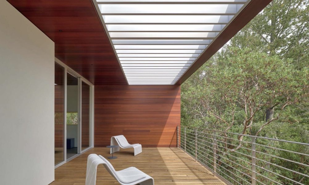
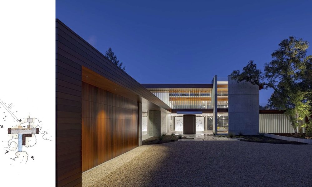
At the top of a gently sloping drive girded by sinuous board formed concrete retaining walls, Whispering Stones straddles the dominant East-West Ridge. The home and the surrounding site work, a cruciform parti anchored by a concrete stair tower, softly tiptoes around existing trees and above the natural topography; it disturbs little. The outstretched North-South primary building mass is at once grounded, then soaring and cantilevered above the land marking a datum to the uninterrupted sweep of valley below.
Small Project
Butterfly House | Net Zero Fire Rebuild
By Kennerly Architecture & Planning
Photography by Bruce Damonte Photography
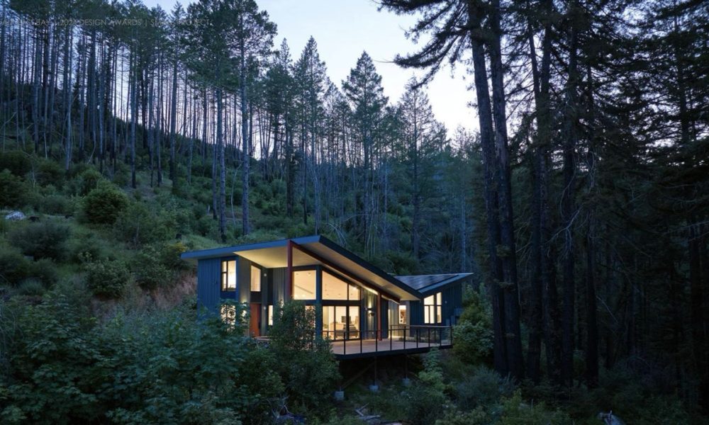
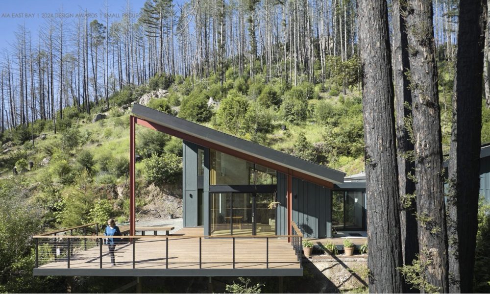
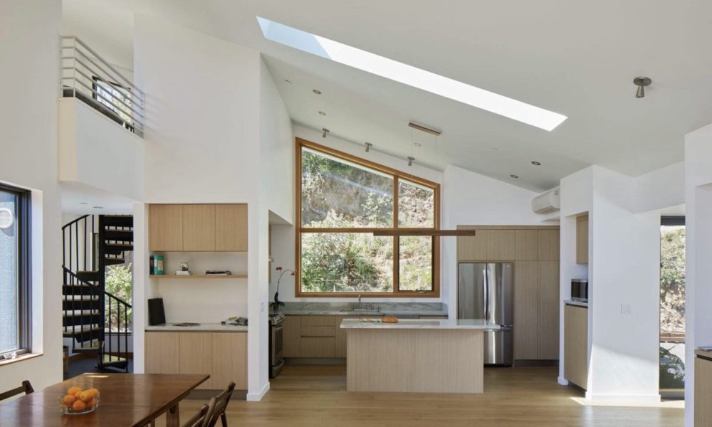
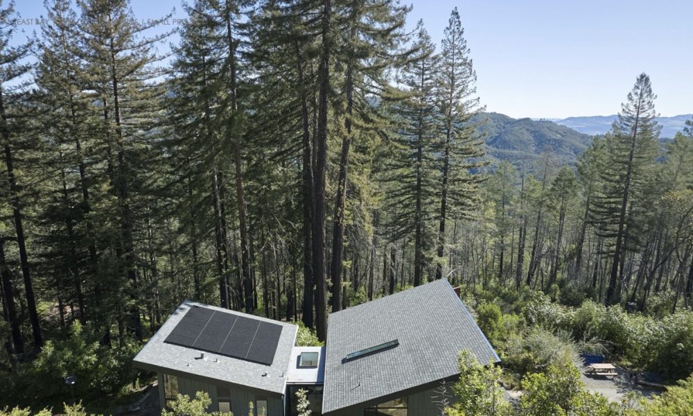
The Butterfly House is the primary residence for a retired music teacher and hot air balloon pilot who lost her home of 47 years in the 2017 Nuns Canyon wildfire. Built on the same site as the original home, the 1,750 square foot structure is a completely new design and a fresh vision for a low-cost sustainable structure to lift the spirits and gather the family.
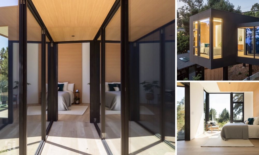
Two shed-roofed volumes – one for sleeping, the other for living – are joined around a glass link set on axis with a cluster of charred redwood trees, a tribute to these stately survivors of the inferno. Set on a north-east slope, the roof configuration opens the interiors up to the tree canopies, ridges and sky. North-east light is welcomed while deep overhanging roofs temper the more intense exposures.
Cuvaison Boathouses
By Goring & Straja Architects
Photography by Bruce Damonte Photography
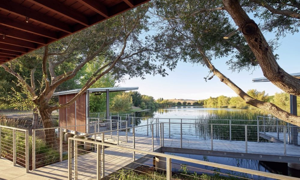
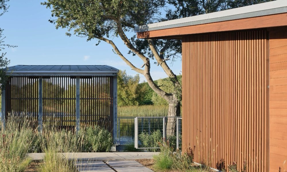
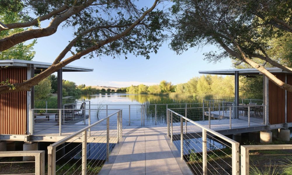
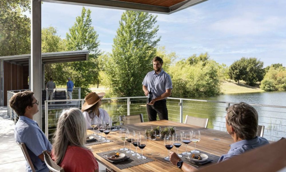
The leadership at Cuvaison Winery approached us to create an intimate wine tasting experience that would showcase the natural beauty of the property near their man-made irrigation pond. Unlike typical winery reservoirs, this pond is surrounded by native plants, creating a waterside environment that attracts several species of waterfowl and migratory birds. Early on, it was decided that placing a tasting pavilion near this unique, natural setting would offer guests a deeper appreciation for the winery’s stewardship of the land, beyond just its vineyards. The goal is to design a space where guests can enjoy their wine while fully immersing themselves in the serene surroundings.
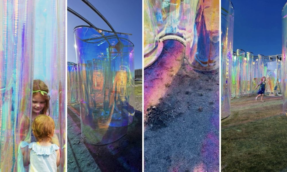
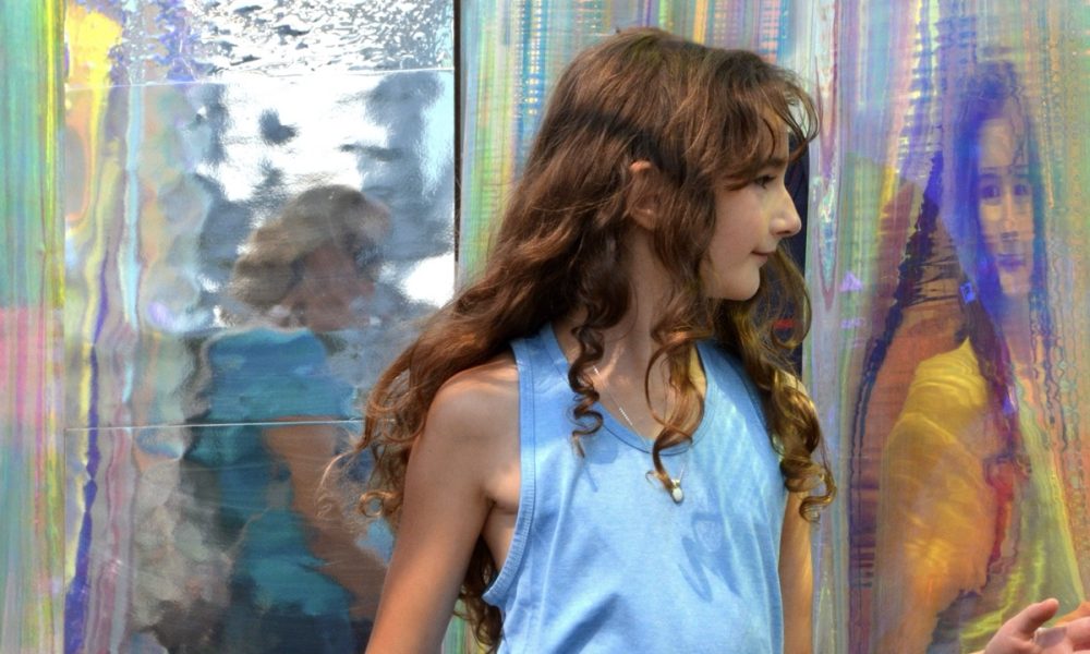
"Inside-O-Scope" Seattle Design Festival
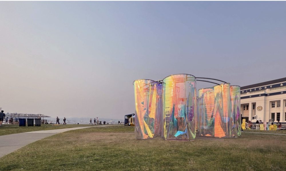
“Inside-O-Scope” is an immersive art installation that sparks social curiosity through joyful exploration. Within this mesmerizing experience, viewers embark on a captivating journey where mirrored surfaces alter their perception of the environment, unveiling new dimensions of wonder. The interplay of light, reflection, and interactive elements creates an atmosphere that nurtures joy and fosters connections. “Inside-O-Scope” invites viewers to embrace the thrill of exploration, igniting social curiosity and a collective sense of wonder.
Unbuilt
Eastshore Infill
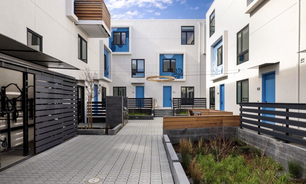
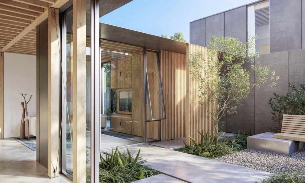
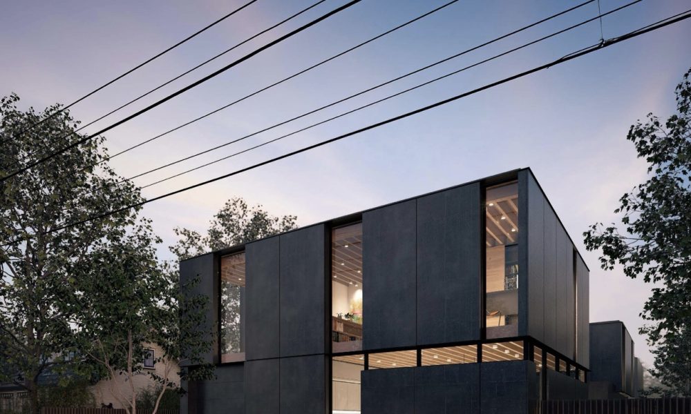
This project focuses on addressing the “missing middle”—housing types that fall between single-family homes and multi-family apartments. These middle-ground options fill a crucial gap needed to meet the diverse needs and income levels in Oakland. The Eastshore Infill project shows how a single-family lot can be transformed by adding a cluster of smaller, well-designed homes centered around courtyards. This approach increases residential density to improve housing availability while maintaining a high quality of life.
Emeryville Public Market Development
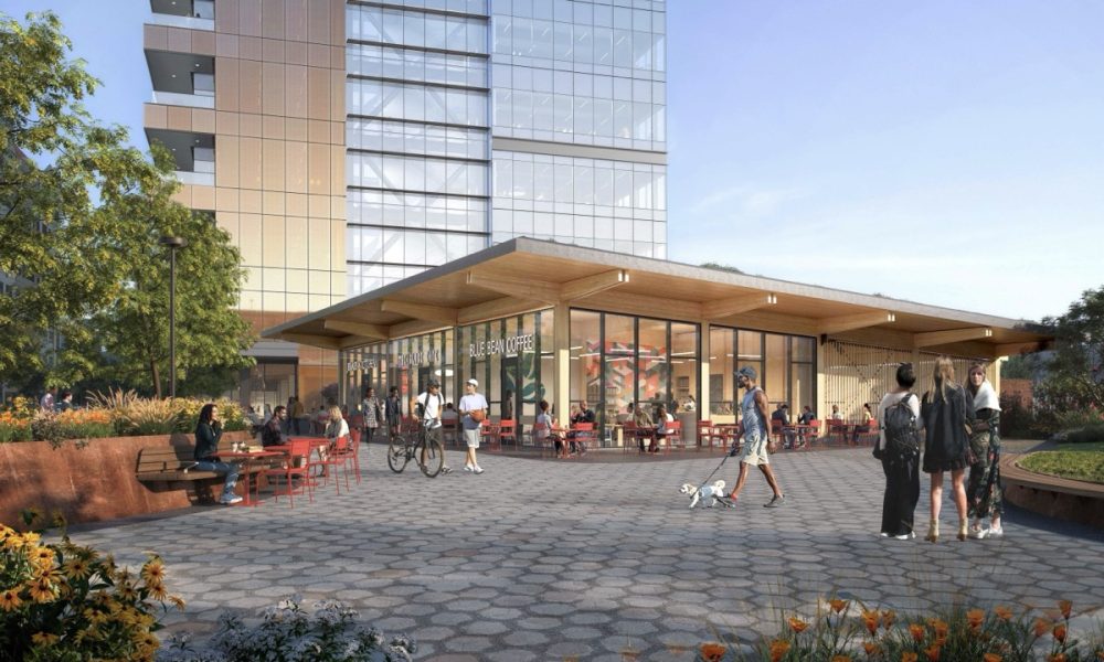
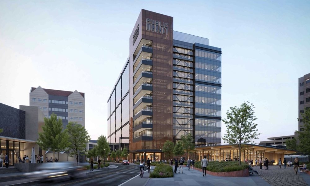
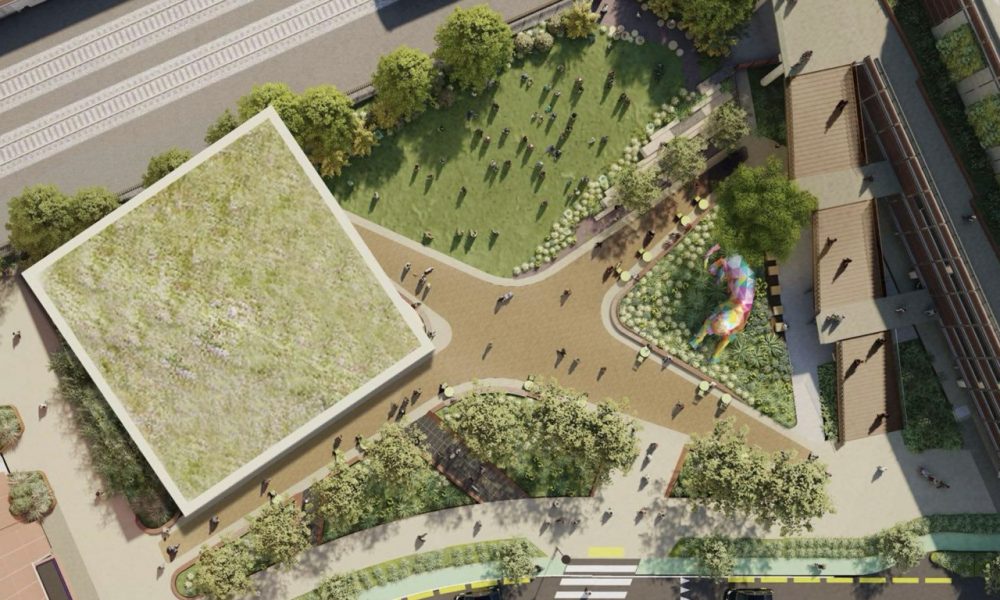
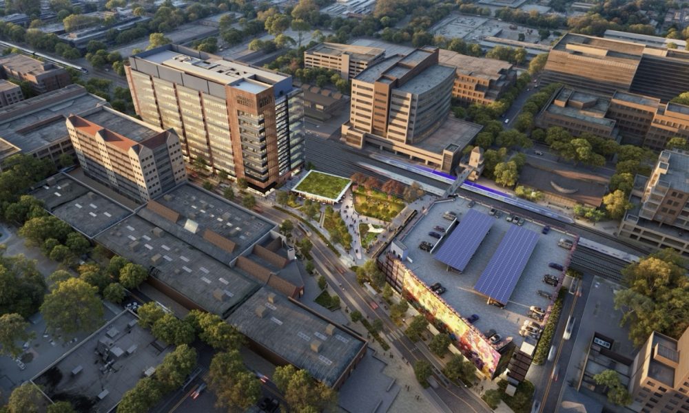
In the 1960s, industries in older inner cities moved away to outlying areas where land was plentiful and affordable. In the 1980’s, the revitalization started with the Emeryville Public Market, housing, and offices. Forty years later the EPMD, on one hand, stiches the area together with a pedestrian bridge spanning the rail-line and a public park, on the other hand, it grows a stronger connection with the East Bay growing convergence of technology and science.
The EPMD project includes a new life science building, pavilion, public park, and parking garage. It blends laboratory, office, retail, and public spaces, integrates Emeryville’s industrial aesthetic and creates an architecturally meaningful neighborhood connection.
Hybrid Shelter
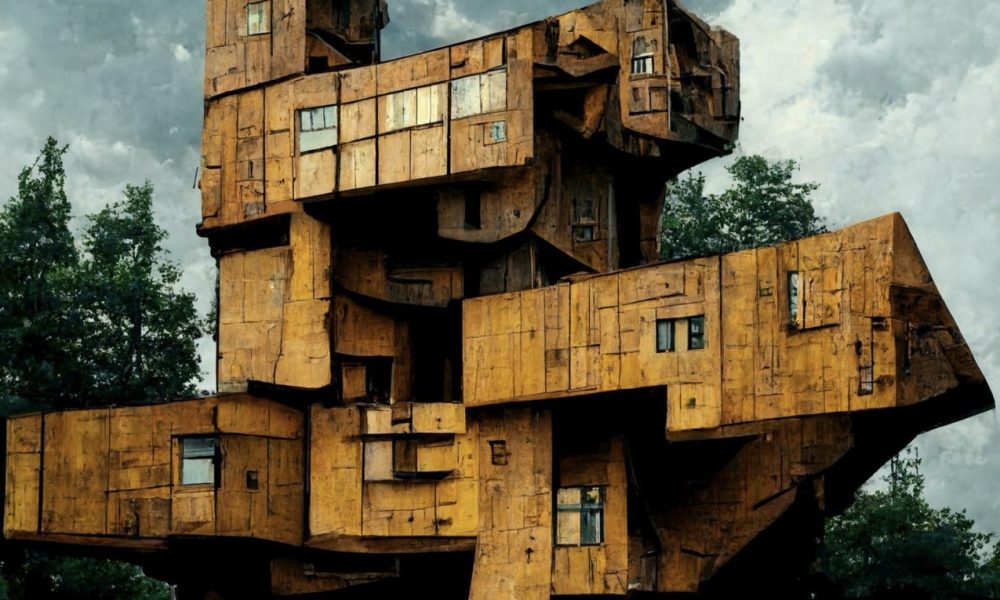
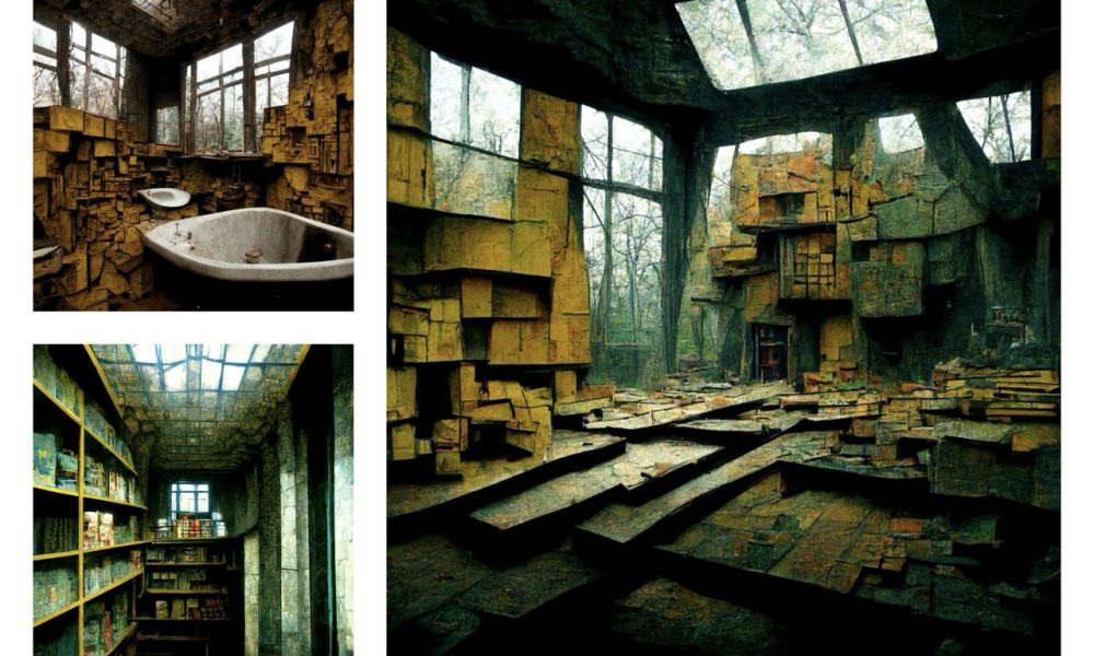
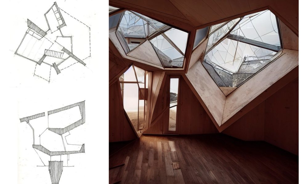
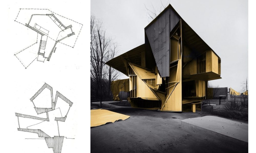
In times of crisis—whether due to war, natural disaster, or widespread homelessness—the need for rapid, resource-efficient shelter becomes paramount. Hybrid Shelter seeks to combine artificial intelligence with human intuition and resourcefulness. This system reimagines the role of the architect, allowing for a decentralized, user-focused process where the final designs are shaped as much by the occupant as by the tools used to generate them.
Western State New Forensic Hospital
By HOK
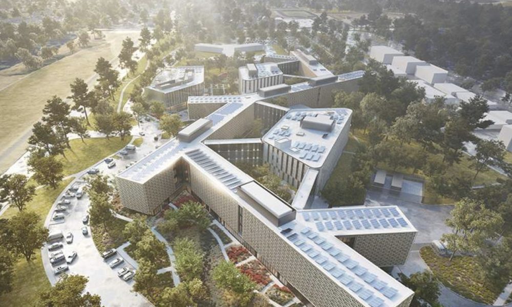
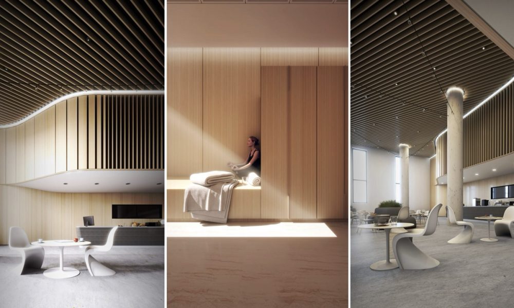
Nestled along the shores of Chambers Bay in Lakewood, Washington, the new facility at Western State Hospital supports the healing and rehabilitation of forensic behavioral health patients. The 350-bed psychiatric facility seamlessly integrates within the topography of the existing 216-acre campus and fosters a therapeutic and safe environment through holistic, evidence-based practices.
Student
Fingers-Pier Climatorium
By Eunice Chan
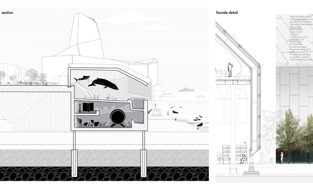
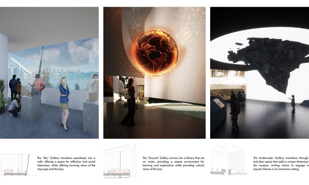
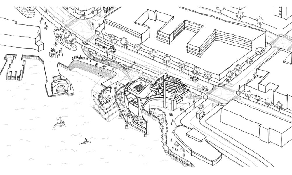
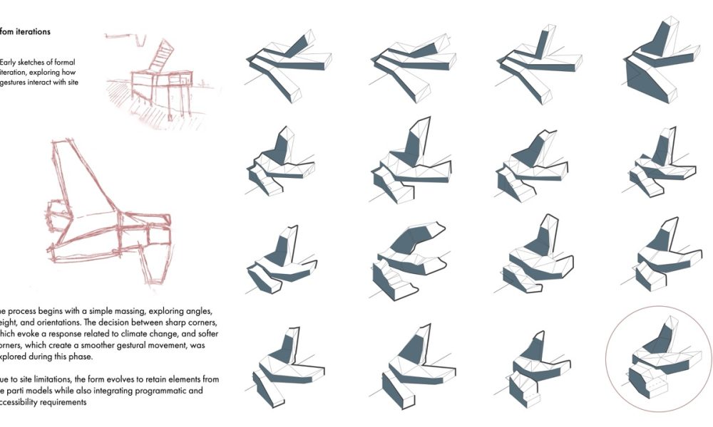
Climate change is a critical issue but often feels disconnected from everyday life for many people. This climate-change museum bridges that gap by emphasizing San Francisco’s unique geographic features and offering visitors an immersive, multi-sensory experience. Drawing inspiration from the site’s history as the “finger piers,” the museum’s gestural form rises dramatically into the sky, extends outward from the waterfront, and submerges into the baywater. This dynamic structure not only mirrors the piers’ historical extensions into the bay but also engages visitors in a journey that heightens their awareness of the natural environment.
Lignin and Lining
By Alexander Arebalo, Maggie Bao, Dimitra Chantzakou, Shenzhou Dai, Yiyao Guo, Zixion Lin, Sihang Liu, Andres Morelli, Clifford Vickrey, Rayna Zhang & Zizhao Zhou
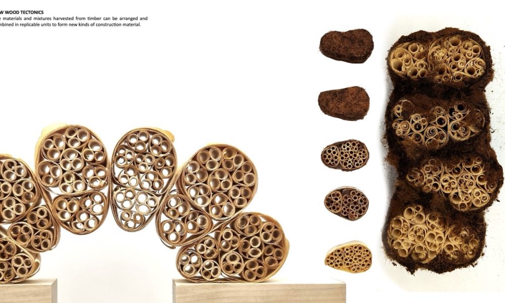
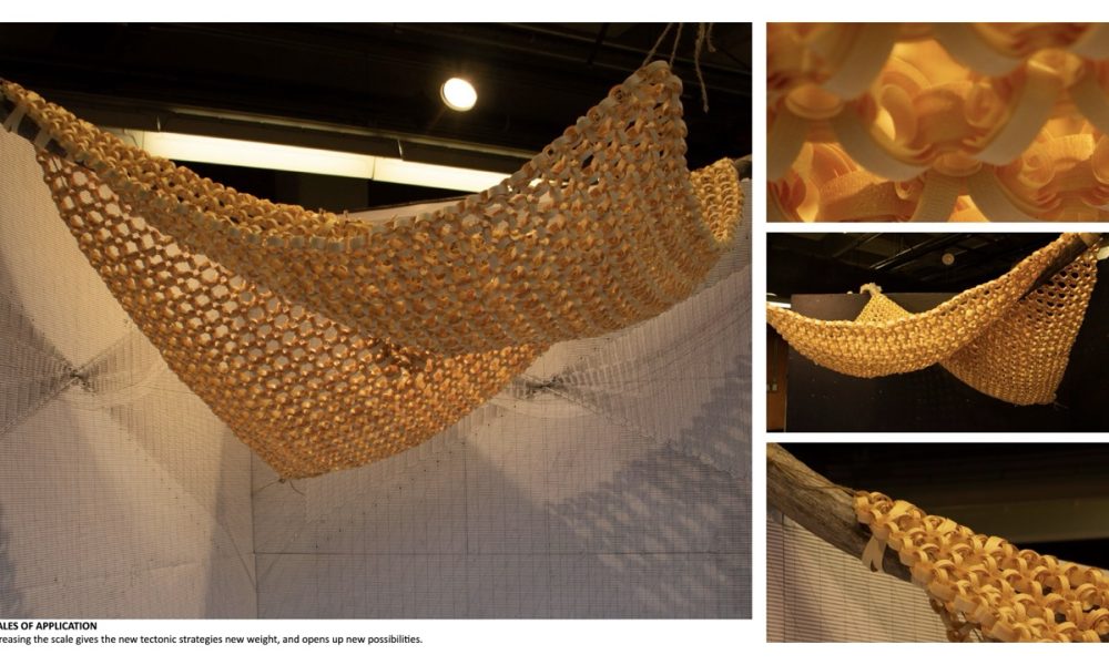
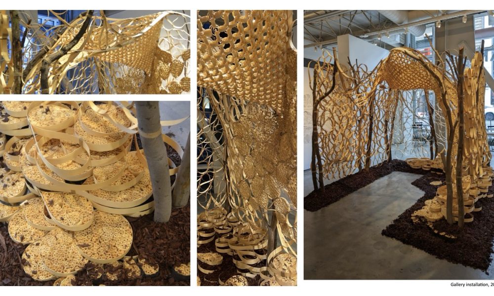
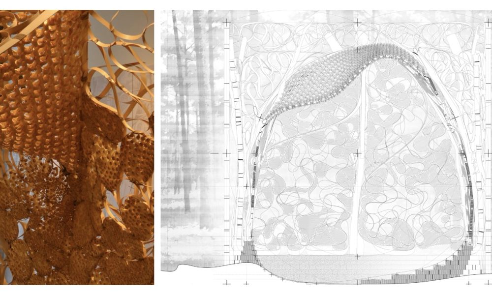
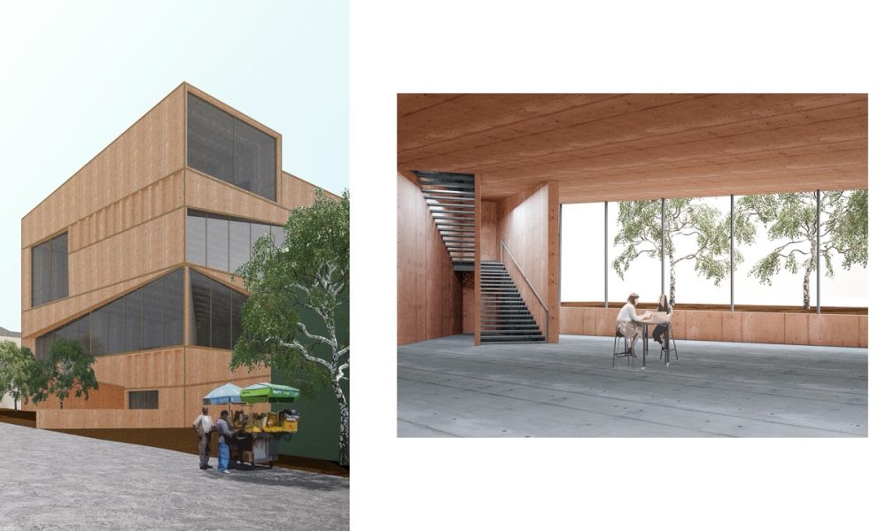
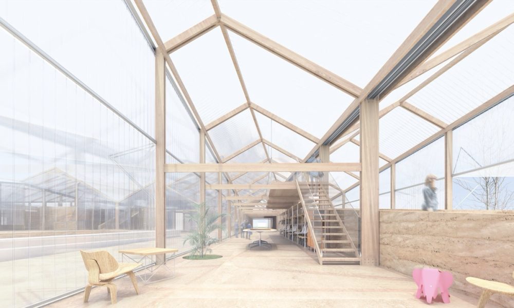
Wood processing and construction has much more waste than we might realize. A tree is so much more than the milled wood products that we typically use, but these other parts are regarded as waste. Bark, with it’s unique fire-resisting capabilities; resin, with it’s water-proofing properties; curved and forked timber, with their organically adaptive load-bearing capacity. By combining these materials with a high-yield processing method of planing to produce wood coils, “Lignin and Lining” investigates the untapped possibilities of wood in construction. While acknowledging human dependence on wood as a building material, it recognizes the far reaching effects of our harvesting and processing methods on the ecologies of which we are a part. It seeks not only to maximize the use of that which we harvest, but also to contribute to the healing and replacement of that which human activity removes and disrupts, through habitat renewal, building resilience against natural disasters, and efficient methods of sustainable forestry. Lignin and Lining proposes an approach to wood processing and manufacturing in the forests near Oroville, CA. It takes advantage of the economic value of material that up to now has been thrown away, while also taking a stance of habitat restoration and more responsible forestry.
Rotated Condenser
By Marina Mezhibovsky
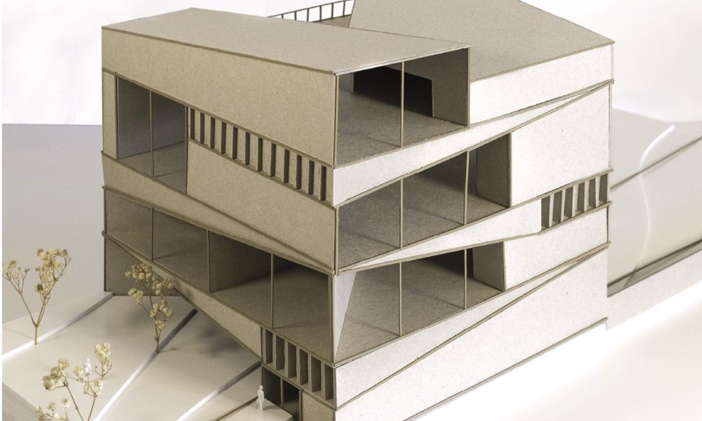
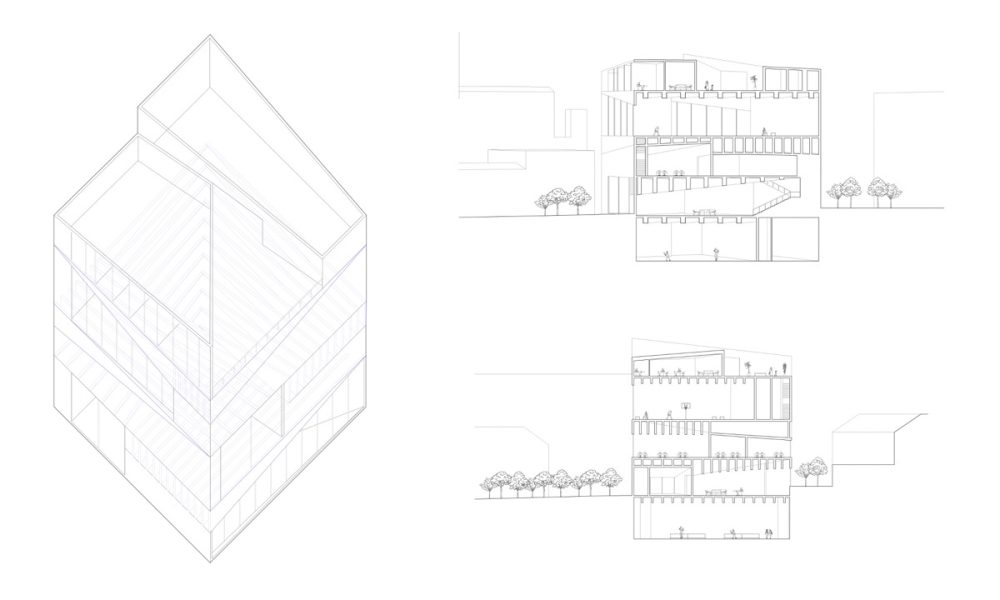
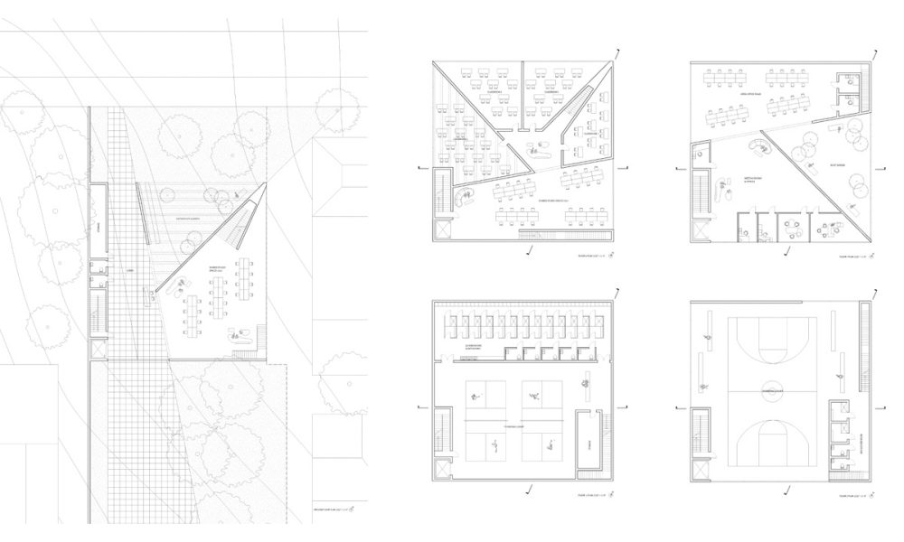
The Rotated Condenser is a social center that forms a hinge between the UC Berkeley Campus and the city. The building contains a mix of athletic facilities and arts spaces. The gymnasia are intended to be highly flexible and used for various purposes, including sports, performances, political rallies, and other events. The arts spaces include a mix of studios and instruction spaces and take a broad view of art production. The form of the condenser was developed from earlier iterations of a square pavilion and then a stack. Each of the four above-ground floors rotates by one side, and structural beams run between each floor.
Seasonal Institute of Fire
By Minghao Xu & Yining Ma
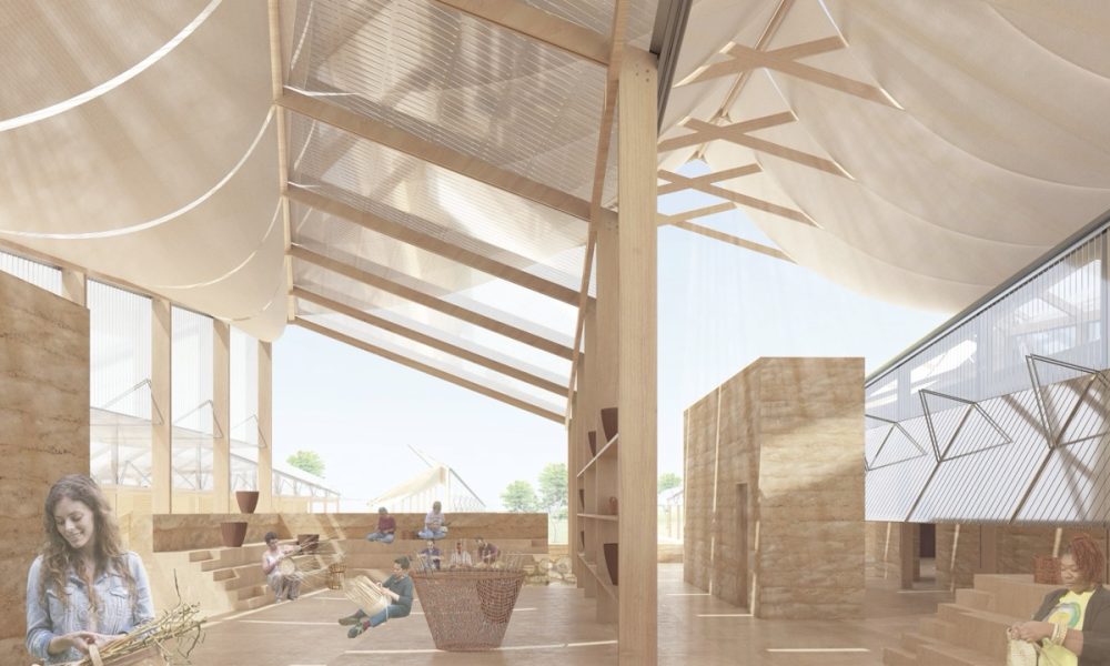
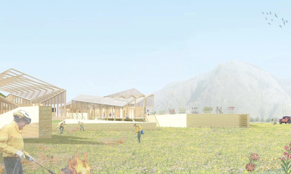
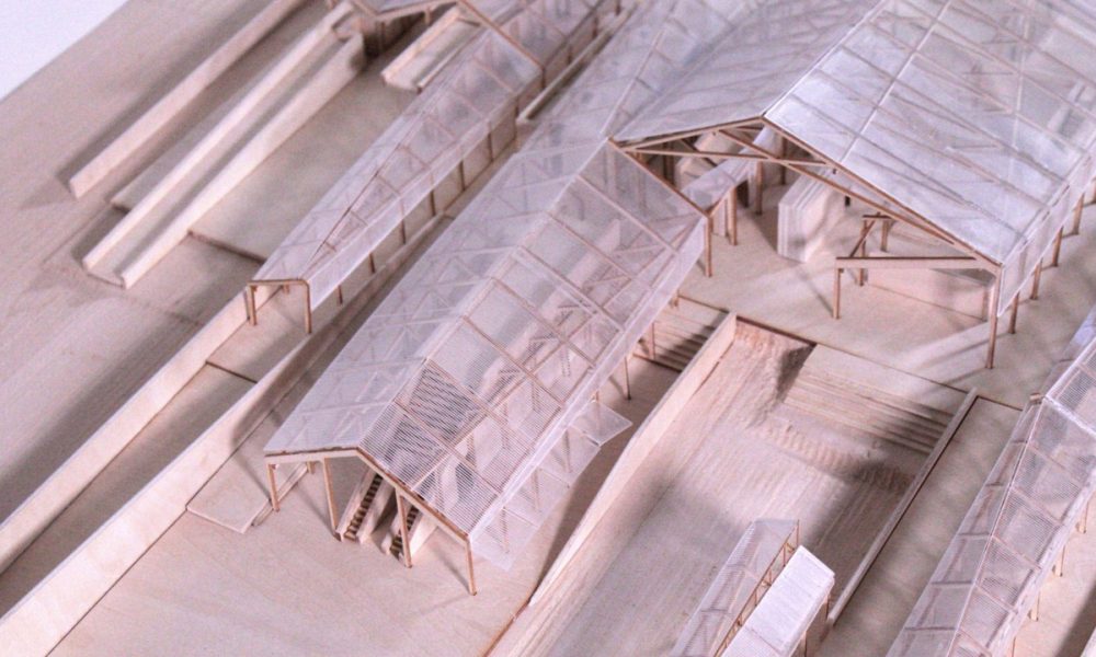
The Seasonal Institute of Fire is an adaptive architectural project designed to integrate human activities with the natural rhythms of California’s wildfire-prone landscape. Inspired by the wisdom of Charles and Ray Eames, the project explores flexibility in architecture, responding to both the environment and the needs of the community.
Located in the fire-affected regions of California, the institute promotes a sustainable relationship between human intervention and natural processes. The concept is anchored in seasonal activities—particularly the Native American practice of controlled burns, which both sustains biodiversity and reduces the risk of wildfire.
Truly TREBA
By Sovann Muni Visal Lay
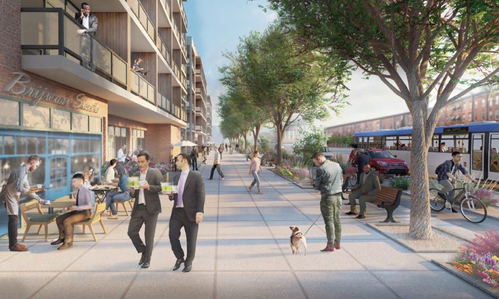
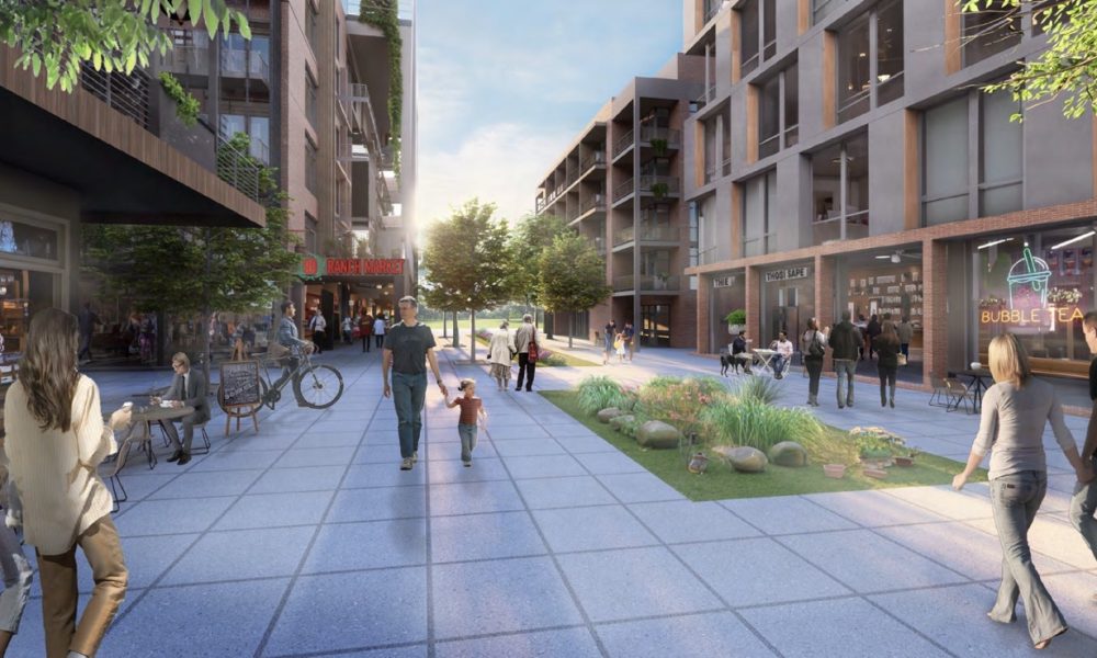
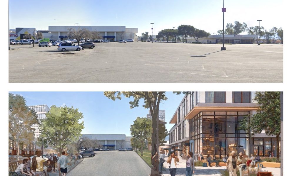
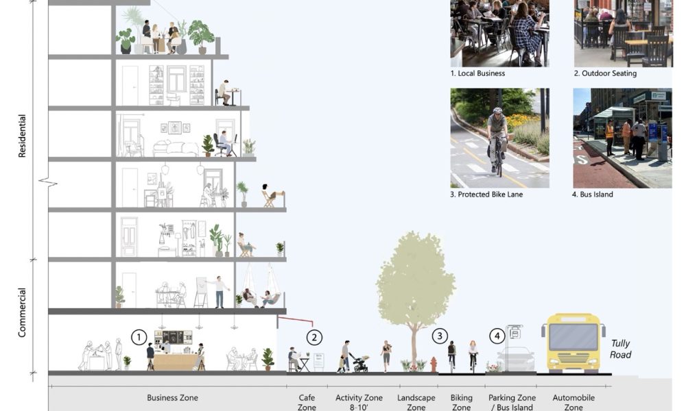
This project, dubbed Urban Repair, aims to transform the Tully Road/Eastridge neighborhood of San Jose into a vibrant, accessible, and inclusive community. Located near Highway 101, this six-lane corridor currently features outdated buildings, vacant plazas, excessive parking, and strip malls. As an IRS-designated opportunity zone, it holds significant potential for redevelopment that enhances both functionality and aesthetic appeal. The Urban Repair initiative will replace outdated structures with modern, visually appealing buildings, prioritizing contemporary urban design principles and a human-scale approach while incorporating environmentally sustainable practices in new construction.
Interested in hearing how the jury chose these projects? Before our Design Awards Gala we will be posting an intimate Fireside Chat with three of our judges. Learn more here.
Congratulations to the firms and individuals who were shortlisted for this year’s Design Awards, and we hope to see you at the Gala!

